Luminar Neo review and tutorial
Written by: Nate Torres
Last updated: July 30, 2024
Luminar Neo - illuminating the future of revolutionary photo editing...
To see the video review and tutorial I did for Luminar Neo, you can watch it here:
Luminar Neo review
After performing a deep dive into Luminar Neo and all its features, I've divided my review into seven different categories:
1. Target audience
First, Luminar Neo seems tailor-made for photographers who want powerful results without the steep learning curve of some more complex software (I'm looking at you, Adobe). Beginners will find solace in its user interface, while professionals can harness the depth of its tools and AI-driven capabilities, such as the specific Portrait and Landscape tools.
The software strikes a harmonious balance, catering to both those who want quick edits and those who wish to dive deep into creative processes.
2. User interface
I enjoy the user interface of Luminar Neo. It's a breath of fresh air. Navigating Luminar Neo is a breeze. The interface is clean and intuitive, with a modern design that organizes tools and features. There are only three main panels - Catalog, Presets, and Edit.
3. Standout features
As someone who primarily captures portraits, I find the Portrait Photography features in Luminar Neo particularly impressive. SkinAI and BodyAI tools are game-changers, providing subtle yet impactful enhancements that maintain realism while bringing forward the subject's best self.
As someone who loves controlling and finding the right light for my portraits, I also loved the Studio Light tool. I was also pleasantly surprised with the Portrait Bokeh AI tool.
The way each tool is classified into Essentials, Creative, Portrait, and Professional also makes it very easy to understand what tool should be used for what.
4. Software performance
While Luminar Neo packs a hefty punch of features, it occasionally takes a moment to catch its breath, especially when loading those robust AI tools. However, this slight pause is a small price to pay for the sophistication it adds to your images.
5. AI enhancements
The AI enhancements are Luminar Neo's crown jewels. We are indeed in the future of photo edits. They offer an unprecedented level of support in image editing, allowing for automatic corrections that would typically require a nuanced hand. From exposure to skin imperfections, the AI consistently impresses with its ability to elevate a photo.
6. Extensions
For those seeking to extend Luminar Neo's capabilities, the array of available—and growing—extensions is a welcome feature. These add-ons provide tailored functions and updates, ensuring your software evolves with your photography.
7. Price and licensing
Luminar Neo presents a pricing model that aligns with its user-friendly ethos.
The options cater to different needs and budgets, offering both a one-time purchase and a subscription model, giving you the freedom to choose how you invest in your editing toolkit.
Pros and cons
| Pros | Cons |
|---|---|
| Intuitive UI for easy navigation | Some features can be slow to load |
| AI tools that simplify complex edits | Initial cost may be a hurdle for some |
| Regularly updated extensions | Some AI edits may need manual refinement |
| Flexible pricing options | --- |
| Advanced portrait editing capabilities | --- |
Ultimately, Luminar Neo shines for photographers who value a balance between control and automation. It's the tool that steps in when you want to quickly move from a raw image to a polished product without digging into the minutiae unless you choose to.
Take note!
It doesn't seek to replace the granular control of Photoshop but instead offers a complementary, more accessible approach to photo editing.
If you edit your own photos, I would definitely recommend you try out Luminar Neo to see if it speeds up your workflow while checking out the plethora of useful features they have for photographers.
Luminar Neo tutorial
Catalog panel
Let's take a look at the Catalog section, which provides a clear and organized way for you to manage, view, and select your photos before editing. What I love about the Catalog section is that even if you import a lot of photos, you can quickly and easily find and work on your desired photo.
Let's first explore the left-hand side of the Catalog section, where you can add and organize your photos.
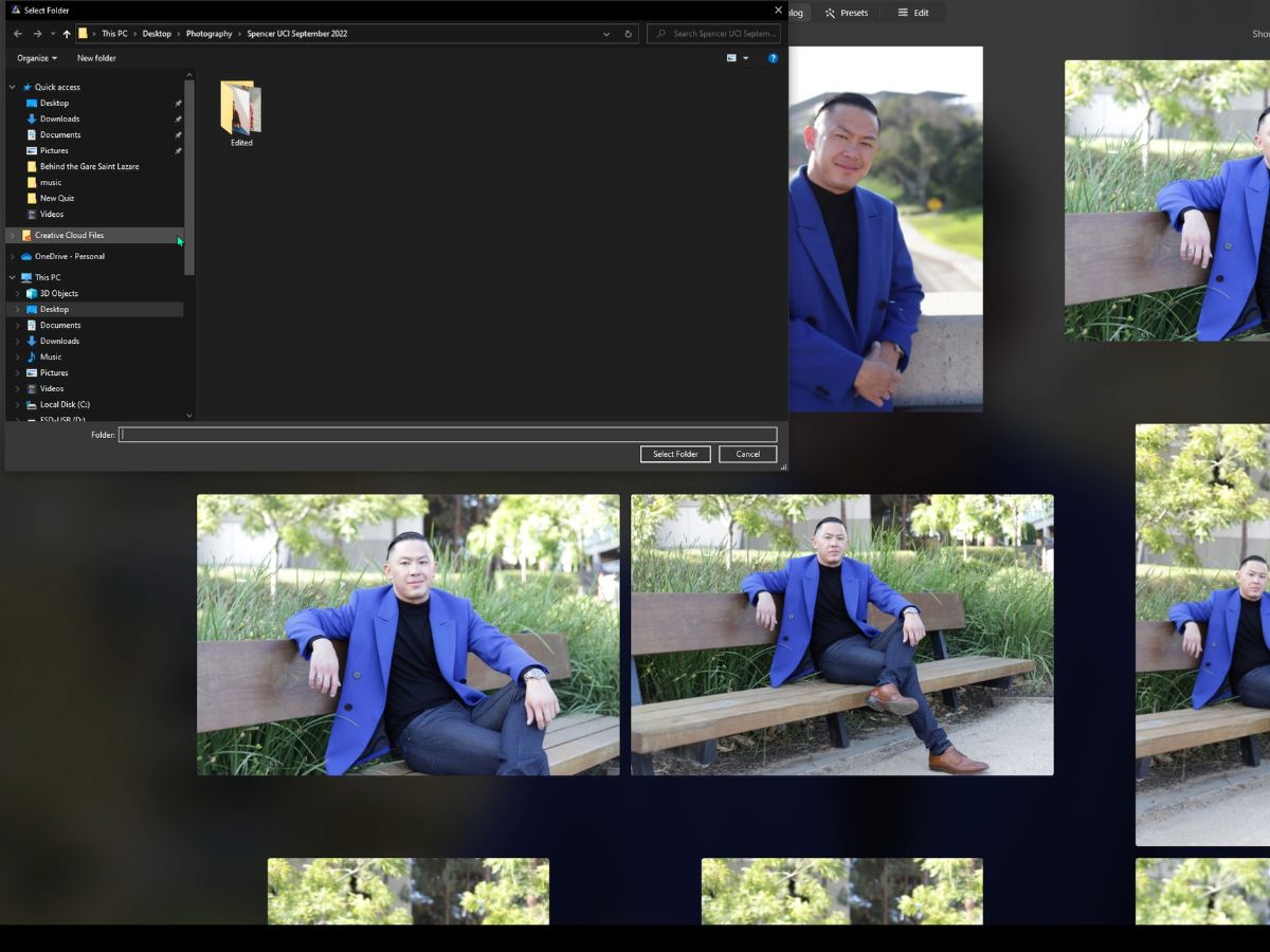
1. Add photos
To import your photos, you hit the Add Photos button, and Luminar Neo will prompt you to choose which photos to import. By clicking on it, you can choose to add individual photos, a collection of photos, or even an entire folder from your storage devices.
2. Organizational categories
Beneath the Add Photos button, we have the different organizational categories.
All Photos
As the name implies, the All Photos category will show every single photo you've imported into Luminar Neo, regardless of where you stored them on your computer.
Tutorial Photos
The Tutorial Photos category curates all the images you can practice with or are there for sample purposes. These are images used for the demo and sampling provided by Luminar Neo.
Single Image Edits (SIE)
Single Image Edits (SIE) is a collection of photos you've opted to edit without adding them to the main library/catalog. These types of photos and categorization are useful for quick edits without adding the image to the more permanent collection.
Recently Added
The Recently Added category is a dynamic collection that will display the photos you've imported most recently. I've found this to be helpful if you're frequently adding new images and just want to edit or review the latest ones quickly.
Recently Edited
The Recently Edited category is another dynamic collection that showcases the photos you've worked on recently. It's a quick and easy way to jump back to your latest edits or projects.
Trash
The Trash category houses all the photos you've chosen to delete from your Luminar Neo library. They will stay in your Trash until you decide to either restore them or permanently delete them from Luminar Neo.
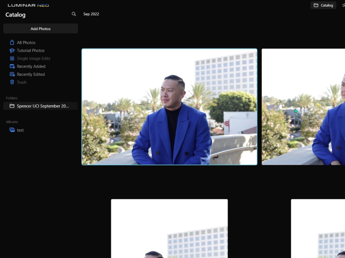
3. Folders
Beneath the different organizational categories, we have the ability to add folders of images. What I love about this section is that this section mirrors your computer's file structure. When you import photos from particular folders on your computer, those folders (and their structure) will appear here.
4. Albums
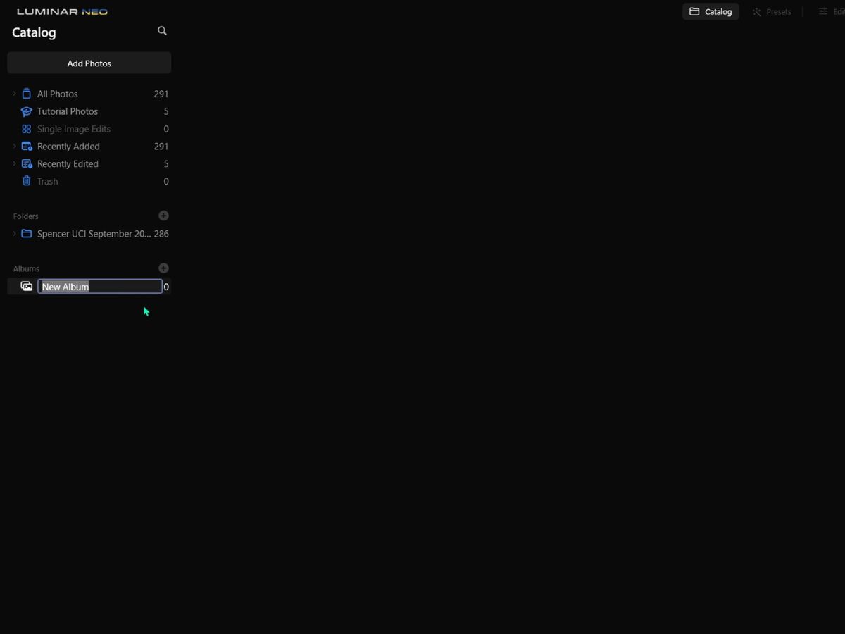
The last section on the left side is the Albums. Albums are virtual collections that you create within Luminar Neo. You can think of them as playlists for your photos.
Adding photos to an album doesn't move the actual file, but it just creates a curated list within Luminar Neo. I found this useful for grouping images from different folders based on themes, projects, or any criteria you choose.
For example, you could have an album for "Vacation 2023" or "Black and White Portraits." Now, let's turn our attention to the central part of the Catalog panel, where you have the visual grid. Here, you can see thumbnails of all the images in your current selection or folder.
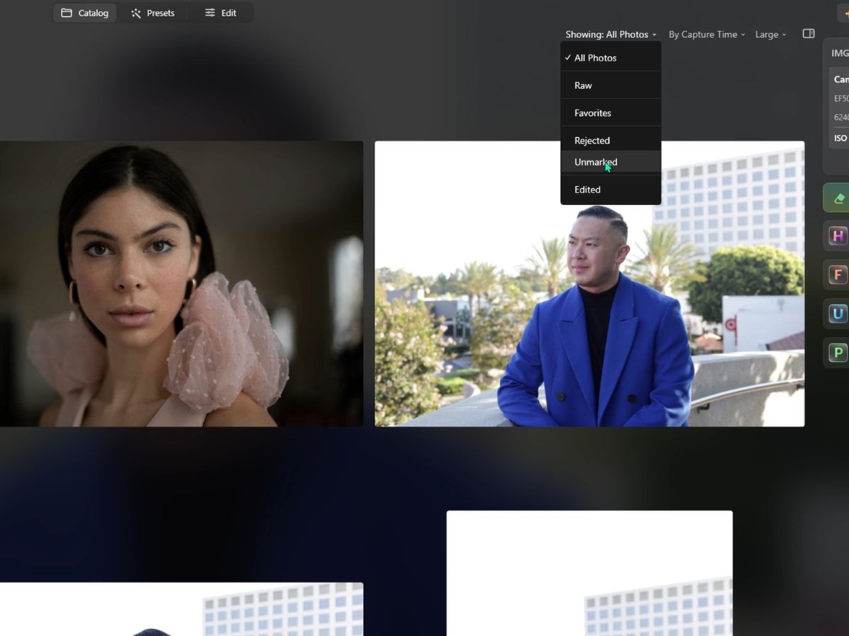
5. “Showing” drop-down
This is a filtering tool that allows you to narrow down the photos displayed based on specific criteria:
- All Photos: Displays every photo in the current folder or album.
- RAW: Filters to show only images that are in the RAW file format.
- Favorites: Shows only the images you've marked as favorites.
- Rejected: Displays images marked as rejected. This is useful for sorting out images you do not plan to use or edit.
- Unmarked: Shows images that have not been flagged, rated, or marked as rejected.
- Edited: Filters to display only the images that have been edited.
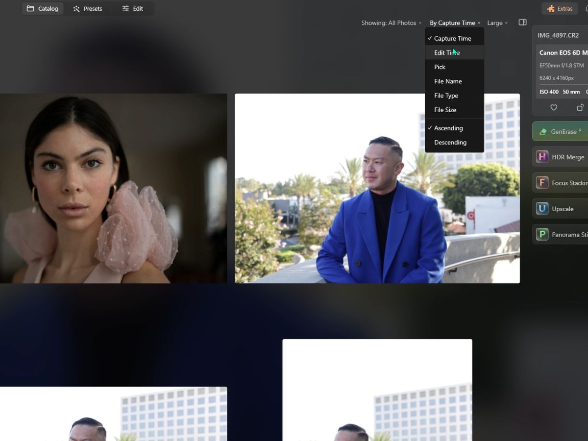
6. Sorting drop-down
This feature lets you sort the visible photos according to different parameters:
- Capture Time: Orders images based on the date and time they were originally taken.
- Edit Time: Sort images by the date and time they were last edited.
- Pick: Refers to images that have been flagged as 'picked' or 'selected' for further action.
- File Name: Organizes images alphabetically by their file names.
- File Type: Sorts images by file format, such as JPG, PNG, RAW, etc.
- File Size: Orders images based on the size of the file, which can indicate the resolution or amount of detail.
7. Thumbnail size slider
At the top right, you often have a slider or a set of icons that let you adjust the size of the thumbnails:
- Small: Smaller thumbnails allow you to see more photos on your screen at once but with less detail.
- Medium: Provides a balanced view between size and detail.
- Large: Larger thumbnails give you a better view of each photo, which helps you identify those that might require editing.
- Largest: This setting maximizes the size of thumbnails for detailed inspection, but it will show the fewest photos on the screen.
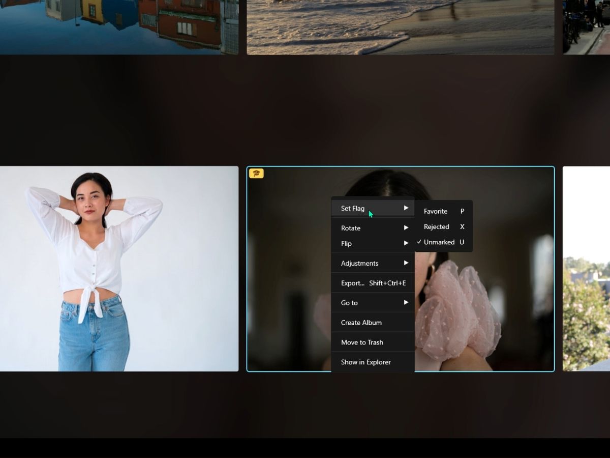
Now, focusing our attention on the actual images, right-clicking each image allows you to perform many different actions on that specific image.
8. Set flag
This option allows you to categorize the selected photo(s) based on your selection process or workflow:
- Favorite: Marks the image as a favorite, which is useful for quickly finding your best shots or those you intend to revisit or showcase.
- Rejected: Marks the image as rejected. This can be helpful when sorting through a large batch of photos, allowing you to filter out the ones you don't want to keep or edit.
- Unmarked: Removes any flags from the image, returning it to a neutral status without any special categorization.
9. Rotate
Offers the ability to rotate the image incrementally, typically by 90 degrees at a time. This is useful for correcting images that are incorrectly oriented:
- Rotate Left: Rotates the image 90 degrees counterclockwise.
- Rotate Right: Rotates the image 90 degrees clockwise.
10. Flip
This will mirror the image either horizontally or vertically. This can sometimes lead to more dynamic compositions or correct images where a mirror image is desired:
- Flip Horizontal: Mirrors the image along the vertical axis.
- Flip Vertical: Mirrors the image along the horizontal axis.
11. Adjustments
This submenu is crucial for efficiency, especially when working with multiple images:
- Sync Adjustments: If you have made edits to one photo and want to apply the same adjustments to others, this option will synchronize those settings across selected images.
- Copy Adjustments: Copies the editing adjustments you've made on the selected photo, allowing you to paste them onto another.
- Paste Adjustments: Pastes the previously copied adjustments to the selected photo.
12. Export
This option allows you to export the selected image(s) to various file formats and set parameters like file size, quality, resolution, and naming, preparing the image for printing, sharing, or publishing.
13. Go To
This helps in quickly finding related images:
- Same Date: Filters your library to show all images taken on the same date as the selected photo.
- Folder in Library: Jumps to the folder location within the library where the selected image resides.
14. Create album
Allows you to create a new album with the selected image(s) or add them to an existing album. Albums are virtual collections and do not affect the physical location of the files on your storage.
15. Move to trash
This option will remove the selected image(s) from the library and move them to the software's Trash or Bin. They remain recoverable until the Trash is emptied.
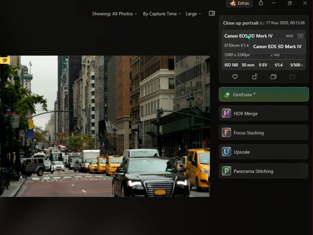
16. Metadata
When you left-click on an image, you can see the metadata on the right. This metadata, also known as EXIF data, provides detailed information about the settings used when the photo was taken. This can be useful for both learning and for understanding he context of your shots:
- White Balance: This indicates the white balance setting used when the photo was taken. It can show if the balance was set to auto or manual
- Metering Mode: This describes how the camera measured the light for the photo. Standard metering modes include evaluative (matrix), center-weighted, and spot metering.
- Lens Used: This displays the make and model of the lens attached to the camera. This information can be useful for determining the lens's correlation with image quality and characteristics.
- ISO: Shows the ISO setting, which determines the sensor's sensitivity to light. Lower numbers mean less sensitivity (and less noise), while higher numbers increase sensitivity (but can increase noise).
- Lens Focal Length: This indicates the focal length at which the photo was taken, usually in millimeters (mm). It gives you an idea of how zoomed-in or wide the shot was.
- Exposure Value (EV): Sometimes referred to as exposure compensation, this shows any deliberate over- or under-exposure adjustments made to the shot.
- Aperture: The aperture setting (f-number) used in the photo indicates how wide the lens was open. Smaller numbers (e.g., f/2.8) mean a wider aperture, which allows more light and achieves a shallower depth of field.
- Shutter Speed: Displays the duration of the exposure, indicating how long the camera's shutter was open to allow light to hit the sensor. It's typically represented in seconds or fractions of a second (e.g., 1/500s).
I love to review the metadata of my images, especially for images that I found to be really good. This way, I know what went well, so I can replicate it again next time.
17. Extensions
Underneath the metadata, you can find some of the extensions if you have them installed, such as GenErase, HDR Merge, Focus Stacking, Upscale, and Panorama Stitching. You can find other extensions, such as Noiseless, Supersharp, and Magic Light, in the Edit Panel. In Luminar Neo, extensions add extra functionality that goes beyond just its standard editing capabilities.
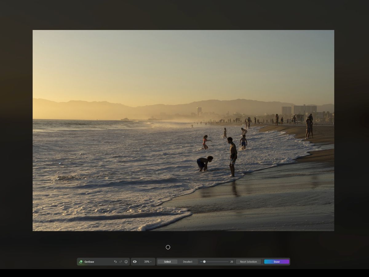
GenErase
GenErase uses AI to analyze the surroundings of the unwanted element and convincingly fills in the space once the element is removed.

HDR Merge
A High-Dynamic-Range (HDR) Merge is used to combine multiple photos of the same scene taken at different exposure levels. The resulting image has enhanced details in the shadows and highlights, effectively extending the dynamic range beyond what a single exposure could capture.
Focus Stacking
Focus stacking combines several images taken at different focus distances to give a resulting image with a greater depth of field (DOF) than any of the individual source images. It's commonly used in macro and close-up photography, where the depth of field is extremely shallow.
Upscale
Upscaling is the process of increasing the resolution of an image using software algorithms. This can make an image larger without the usual pixelation or loss of quality that can occur when enlarging photos. It's particularly useful for printing larger sizes or for cropping into a photo without losing detail.
Panorama Stitching
Panorama Stitching allows you to combine multiple images into one wide panoramic image. It's useful for landscape photography, where you want to capture a broad scene that can't be captured in a single frame.
Presets panel
The Presets Panel is fairly straightforward and lists out all the presets you can add to your photos. What I love about the presets is that you can hover over them, and it will show you what the image will look like. This panel simplifies the photo editing process, especially for users who want to achieve professional-looking results without delving into manual adjustments.
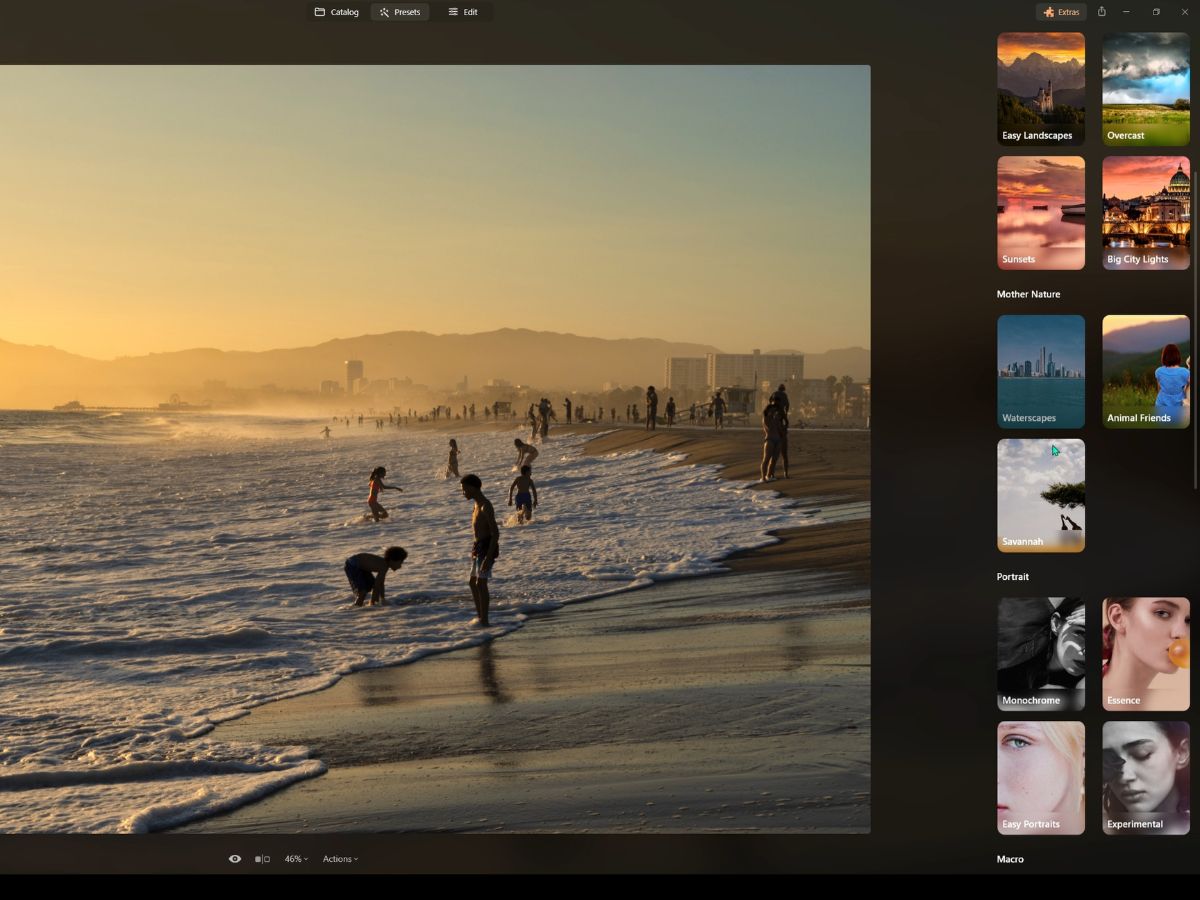
Here's an overview of the types of presets typically found in this panel:
Presets Recommended for Your Photo
These are intelligently suggested presets based on the analysis of the current photo. The software may consider factors like exposure, color, and subject to recommend suitable presets.
Essentials Presets
These are general-purpose presets that provide basic adjustments suitable for a wide range of images. They might improve brightness, contrast, saturation, and other foundational aspects of an image.
Landscape Presets
Designed specifically for landscape photography, these presets often enhance natural elements such as skies, foliage, and water and may optimize the overall dynamic range.
Mother Nature Presets
These are similar landscape presets but possibly more focused on bringing out the details and colors found in natural settings, like enhancing greens in forests or blues in skies.
Portrait Presets
Portrait presets are tailored to improve skin tones, sharpen eyes, and generally flatter the subject in portrait photography.
Macro Presets
For close-up photography, macro presets may enhance details, textures, and contrast to make the subject stand out.
Cinematic Presets
These presets give photos a movie-like quality, often adding dramatic lighting, tonal adjustments, and color grading that mimic film styles.
Lifestyle Presets
These presets are likely designed to suit photos depicting everyday life, aiming to enhance the mood and aesthetics of casual, candid shots.
Aerial Presets
With the rise of drone photography, aerial presets are designed to optimize the unique perspectives captured from the air, potentially enhancing clarity and adjusting colors to make landscapes stand out. Adding presets to your photo is a great way to have a starting point for your photo edits. You can tweak the edits of the preset you added in the Edit Panel, which leads us to our next section.
Edit Panel
The Edit Panel in Luminar Neo is where the magic of personalization happens, allowing you to modify and enhance your images intricately.
It's thoughtfully divided into different sections to streamline the editing process:
1. Layers section
First, we have the Layers section:
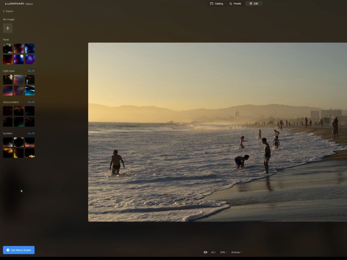
New Image Layer
Here, you can add an additional image as a layer, which can be used for composites or to overlay textures and other elements.
Add Effects Layer
This option allows you to introduce creative elements such as:
- Flares: To mimic the effect of light reflecting inside a camera lens, adding a dramatic touch to the photo.
- Light Leaks: Simulate the effect of light leaking into a film camera to create a vintage or retro look.
- Stardust: This is used to add sparkling effects, like a night sky or glittering surfaces.
- Bokeh: To replicate the aesthetic quality of the blur produced in out-of-focus parts of an image.
- Sparklers: To bring in elements of bright, sparkling light, often used to give images a festive or magical feel.
If these effects don't interest you, you can also purchase more assets by clicking the "Get More Assets" button.
2. Tools section
The Tools section is the toolbox where you'll find all the main editing features, neatly categorized for convenience. Categories might include things like basic adjustments, crop, healing tools, local adjustments, and more, each offering a host of sliders and options to adjust your image.
Let's take a look at each of the editing tools, some example use cases, and what I've found useful for each tool based on my experience:
1. Layer properties
With Layer Properties, imagine you've snapped a picture of a bustling cityscape but want to amp up the drama by dropping in a more dynamic sky from another photo. That's where layers become your best friend. You can stack that brooding cloud formation right over your original skyline without messing with the photo underneath.
It's like having an insurance policy for your creativity—you can try out all sorts of wild ideas, and your original photo stays safe and sound, ready to go back to if you need it.
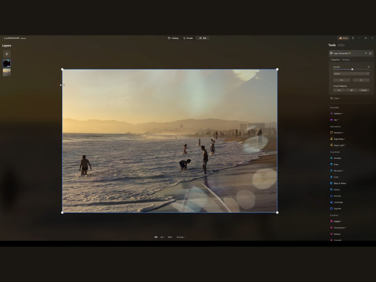
Now let's look at how to use this tool:
Properties Tab
- Opacity: This is all about subtlety and balance. Sliding the opacity down is like dialing back the intensity of a layer. It’s perfect for wanting a hint of an effect without overwhelming the entire image. This is super handy when blending images together—you can control how much of the overlaying image you want to show.
- Blend Modes: Think of blend modes as the secret handshake between layers. They decide how the two layers will interact based on their content. You can have them play nice and subtly blend or make them react to each other for more dramatic effects.
- Horizontal and Vertical Flip: Have you ever taken a picture and wished it was mirrored for a better composition or just to add an artistic twist? These flip options let you do just that, but on a specific layer without affecting the whole image.
- Image Mapping: A less hands-on feature, but pretty nifty. It links different parts of an image together, letting the software do the heavy lifting to ensure everything lines up just right.
Masking Tab
- Brush Mask: Grab a digital brush and paint your mask right onto the image. It’s like telling Luminar Neo, “See this bit here? Yeah, let's change only this part.”
- Linear Gradient Mask: This is perfect for those times when you want the edits to fade out smoothly—think of darkening a sky without touching the horizon line.
- Radial Gradient Mask: Want to highlight a subject with a soft vignette effect? That’s where the radial mask shines, letting you create a spotlight or a gradual transition with ease.
- Mask AI: This is like having a smart assistant in your toolbox. Mask AI can differentiate elements in your photo—people, skies, buildings, you name it. It automatically creates precise masks for you, which is a huge time-saver.
Mask Actions
- Fill, Clear, Invert, Copy, Paste: These actions are straightforward but powerful. You can fill a mask over your entire image, clear it off, invert its effect, or copy and paste it to another layer. It's like having a toolkit for quick fixes and adjustments without starting from scratch.
- Show: Finally, this toggle lets you see the mask as a red overlay. It's great for precision—like having an x-ray vision of your edits.
2. Crop
Now, let’s chat about Crop.
Picture this: You've taken a stellar shot that you're keen on sharing on Instagram, but the composition's a bit off—it’s not quite giving that punch you were hoping for.
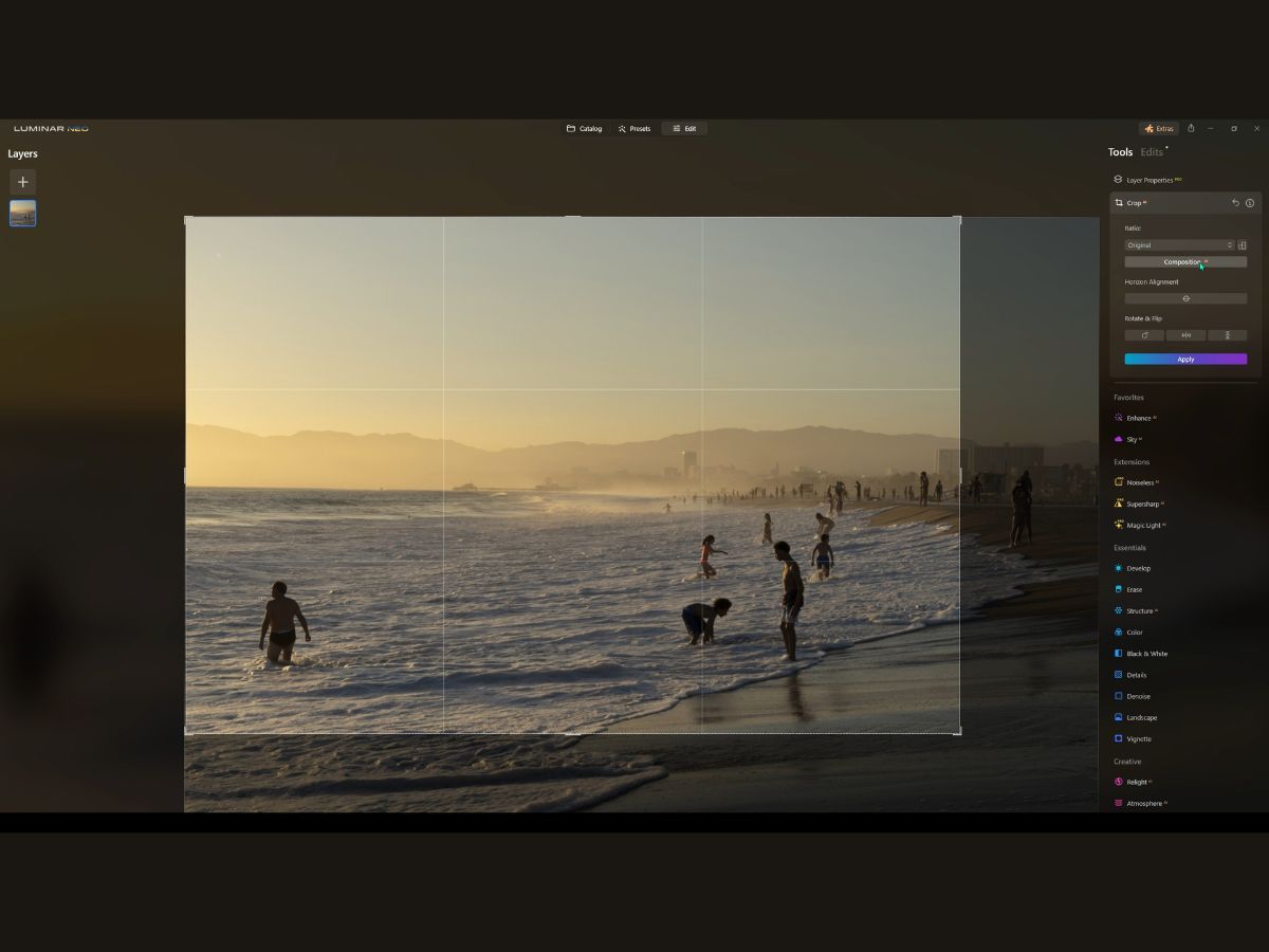
The CropAI is like having a little assistant within Luminar Neo who tidies up that composition, making it snappier and more balanced, just with the click of a button. And if you're like me and you prefer to have your hands on the wheel, you can take manual control and tweak that crop until it's picture-perfect for wherever it's destined—be it a gallery wall or a Facebook feed.
Let's talk about what you can do with the crop:
Ratio
First, you can adjust the aspect ratio of your image. If you need it to have a certain aspect ratio for social media or a frame you want to hang on the wall, then this is when you'll need to ensure the proper aspect ratio.
The crop tool has a bunch of preset ratios, making it easy just to pick the one you need, and voila. No more squishing or stretching your shots.
Composition AI
Composition AI is like the smartest kid in class but for your photos. If you are unsure how to crop your image to fit a compositional technique, just hit the Composition AI button, and it will attempt to figure out the best layout for your shot.
I've found that it works well and often emphasizes the rule of thirds or frames the image tighter to emphasize a certain focal point. It's like an instant eye for design that helps your image look its best.
Horizon Alignment
Horizon alignment adjusts the alignment of your horizon (shocker). This tool comes in handy when the horizon is a little tilted. With a quick slide adjustment, the Horizon Alignment will straighten it out, like a bubble level inside your software.
Rotate and Flip
The rotate and flip features allow you to rotate and flip your images for different looks.
3. Enhancer AI
The EnhanceAI tool is kind of your go-to for quick, intelligent fixes. It’s perfect for those situations where you want to improve the overall look without spending ages on editing. It’s like giving your photo a "boost" button.
So whether you're editing a bunch of photos from a wedding or trying to make that one landscape shot stand out for your Instagram, these AI tools are like your personal editing assistant.
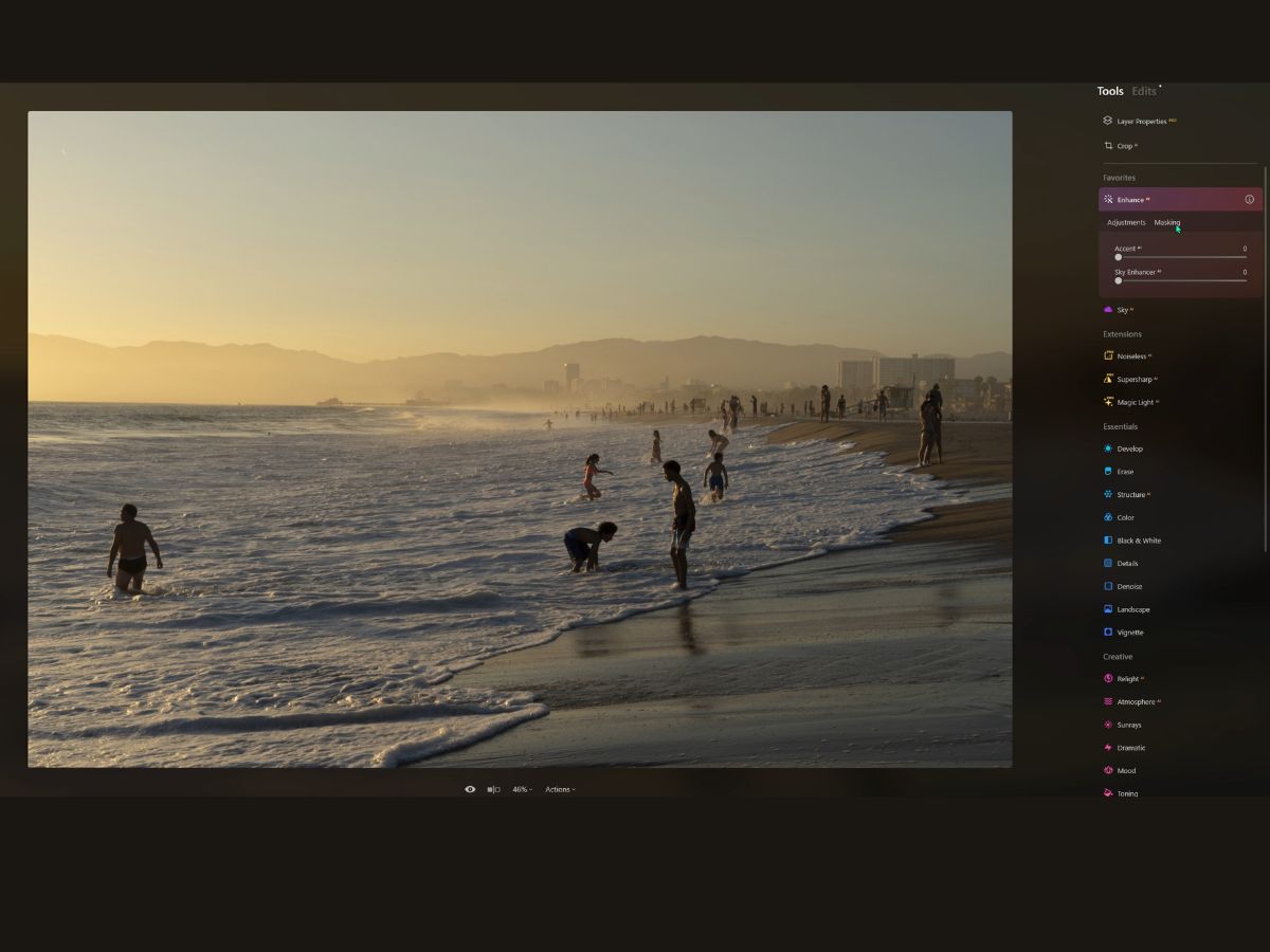
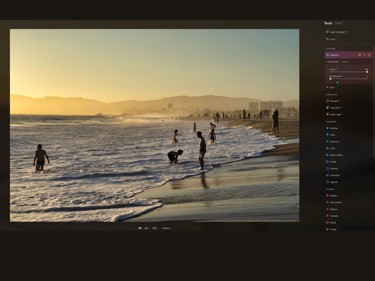
Accent AI
Starting with AccentAI—it’s like a Swiss Army knife for photo editing. Imagine you’ve got this picture that’s almost there, but it’s missing a bit of oomph. Instead of fiddling with a dozen different sliders, you crank up the AccentAI.
It’s one slider that touches up everything—shadows get lifted, highlights pop without getting blown out, and the colors… oh, they just come alive! The beauty of it? You don’t lose that natural look.
Your sunset still looks like a sunset, just… better. It’s fantastic for those shots that need a little bit of everything, but you don’t know where to start.
Sky Enhancer AI
Now, let’s chat about Sky EnhancerAI. Say you’ve taken a photo, and the sky is a bit blah. Not dramatic enough. If you want those clouds to stand out, maybe add some depth to that blue or just give the sky that wow factor. That’s where Sky EnhancerAI comes in.
It's like a detective—it finds the sky, figures out what’s not quite right, and fixes it up. We’re talking texture, tone, the whole nine yards. And it’s smart, so it knows where the sky ends and the rest begins, meaning there will be no more messing up the trees or buildings.
4. Sky AI
Now, let's dive into the Sky AI tool. Imagine you’re looking at a landscape photo you’ve taken. The land is stunning, but the sky is just not doing it justice. It’s flat, lifeless, or maybe even blown out from too much light. That’s where Sky AI comes into play, like a quick-change artist for your photo’s atmosphere.
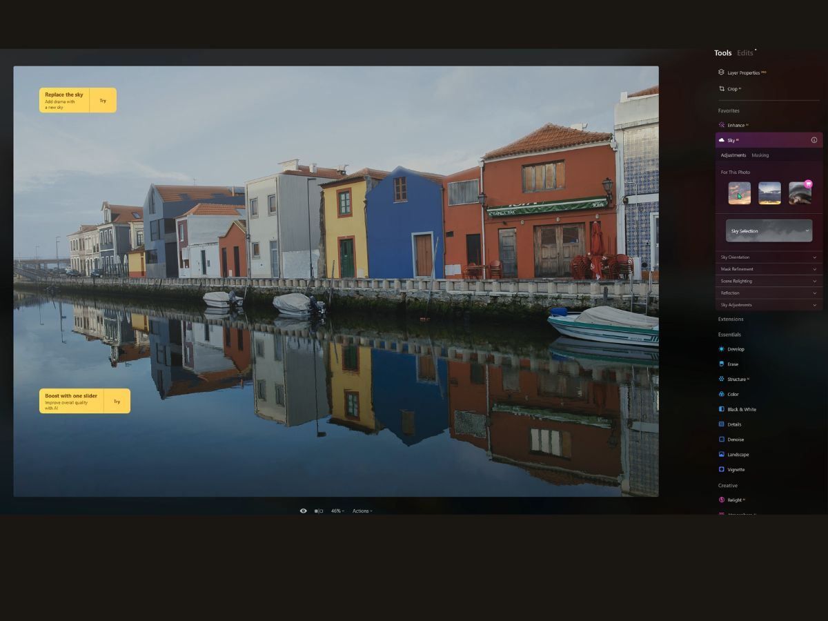
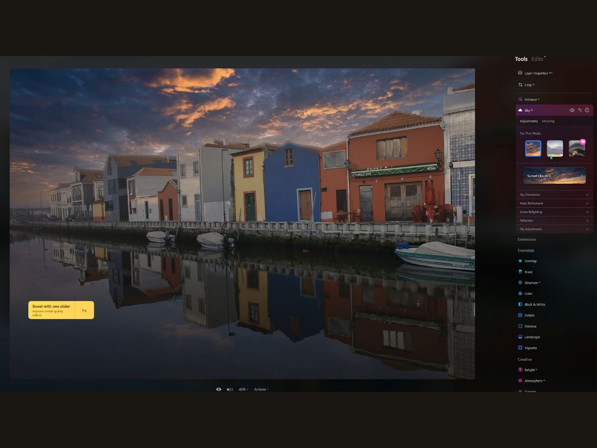
Sky Selection
Sky Selection is your first stop. It’s a buffet of skies you can choose from right in the dropdown menu. You can see what your image would look like with a dramatic sunset, a stormy cloud cover, or a serene blue expanse. Fancy a bit of personal touch?
You can add your own skies to the mix. Just hit that plus icon, and you can bring your personal sky collection into the tool. And don’t go overboard—less than 50 is the sweet spot for keeping things running smoothly.
Sky Orientation
Next, we've got Sky Orientation. This isn’t just about slapping a new sky on top; you can adjust the horizon position with the precision of an artist. Want the sky lower or higher? No problem.
And if the sky is slightly tilted, you can straighten it out until it looks just right. The sliders here are like fine-tuning your sky’s placement in the frame, giving it that perfect home in your photo.
Mask Refinement
Mask Refinement is about the details. It blends the new sky so well that it'll look like it was always there. If you have tricky spots like tree branches or intricate structures, the Close Gaps and Fix Details sliders will be your heroes, patching up any imperfections.
Scene Relighting
Now, Scene Relighting—this is where the magic happens. It’s not just about swapping skies; it’s about making the entire scene worship the new sky. The tool adjusts the lighting of the original scene to match the mood of the new sky. It can even adjust the colors and the relight for humans in your shot, making everything look natural.
Reflection
But what if your photo includes a reflective surface, like a lake or a puddle? Enter Reflection. This feature will create a reflection of your new sky in the water, making it look incredibly realistic. With Water Blur, you can match the sky’s reflection to the water’s surface, whether calm or rippled.
Sky Adjustments
Finally, Sky Adjustments allow you to ensure the new sky fits the original scene's focus and exposure. If the original sky had some haze, you can add that in, too. And don’t forget about matching the grain for that seamless, realistic effect.
5. Noiseless AI
Now, let's take a look at Noiseless AI, which helps clean up your images. Let's say you're out shooting the starry night sky or capturing an indoor event where the lighting is less than ideal. You crank up the ISO because you need the shot, but later, as you review your images, you see it—noise, those tiny dots or speckles that are the digital equivalent of photo acne.
It's frustrating, right? Enter Noiseless AI, like a skincare routine for your photos. The extension is super intelligent and gives you a hand with presets for different levels of noise: low, middle, or high. It's like having an expert who suggests, "Hey, this will clean up your image real quick." But if you're the hands-on type, you've got manual controls to play with, like Luminosity Denoise and Color Denoise.
Luminosity Denoise
Think of Luminosity Denoise as your dimmer switch. There is too much luminance noise, and your image looks like it's got digital goosebumps. Slide that Luminosity Denoise and you can smooth things out while keeping the important bits crisp. It's all about finding that sweet spot where the image goes from grainy to creamy without turning into a watercolor painting.
Details Slider
Then you’ve got the Details slider. This little gem is for when you’ve smoothed out the noise, but you don’t want your image to lose its edge—literally. It brings back the textures and the finer points that make your image pop. It's like telling your photo, "I want you to stay smooth, but don't lose your sharp wit."
Sharpness Slider
Finally, we sharpen things up. The Sharpness slider is your way of saying, "Hey, let's bring clarity back into the picture." This is for when you've dealt with the noise, but your image has become a bit soft around the edges. With a nudge of the Sharpness slider, you're back to those defined lines that give your picture depth and character. But just like adding salt to your food, you gotta do it with care—too much, and you'll notice.
6. Supersharp AI
Supersharp AI is like the eyeglasses for your photos. Do you know how everything looks a bit fuzzy when you've misplaced your specs? Then you put them on, and bam! The world looks crisp and detailed. That's what Supersharp AI does for your shots.
Universal Correction
First up, there's Universal Correction. It's like the tool says, "Let's tidy up," and gives your entire image a clarity boost. This is for those photos where everything's just a tad soft. It's not about dramatic changes; it's more like fine-tuning your vision across the whole picture.
Motion Blur Correction
Then, there's Motion Blur Correction. Now, this is the magic wand for those pictures where something was moving a bit too fast. Maybe it was your camera because you couldn't hold still, or perhaps it was the subject zipping by. This feature examines the blur, determines its direction and speed of movement, and reverses the mess. It's like turning back time to when your photo was sharp.
Low, Middle, High Options
You have three options: low, Middle, and High. It's like choosing the strength of your eyeglasses. Low for when the blur is just a shy guest at the party, Middle for when it's making itself known, and High for when the blur is the life of the party and you need to calm it down a notch.
Face Enhancer AI
Lastly, Face Enhancer AI is like that friend who always wants you to look your best in photos. It focuses on faces, clearing up the fuzziness so that you can see the smiles and twinkles in the eyes. It's like it knows that behind every blurry face is a clear, sharp portrait waiting to shine.
7. Magic Light AI
Think of it as the fairy godmother for your photos, but instead of turning pumpkins into carriages, it's turning lights into, well, magic. It’s like having a little digital wand to wave over any photo with lights to sprinkle a little extra sparkle here and there.
Let’s say you’re looking at your holiday snaps, and there’s this one picture of the Christmas tree that’s just a bit… meh. The lights are pretty, but they’re not popping like they did in your living room.
With Magic Light AI, you can amp up those tiny lights. Crank up the ‘Intensity’ and watch them go from dull to dazzling. Play with the ‘Size’ to make the beams look like they're reaching out to the rest of the photo.
Then there’s the ‘Beam Width’—that's how you get that majestic spread of light, like when sunlight peeks through the clouds. It's perfect for making those street lamps look a little less lonely and much more dramatic in your after-hours city shots.
And the ‘Glow’—oh, the glow is the cherry on top. It adds that halo of warmth, making everything feel like it’s in a cozy bubble.
‘Clearness’ is all about the edges. Want your beams crisp, like a laser show? Or soft and fuzzy, like a morning mist? That's what you adjust to get it just right.
And ‘Number of Beams’? It’s for when one beam just isn't enough, and you need an entire rock concert light show coming off that bicycle headlight.
For indoor photos, especially with those trendy Edison bulbs, Magic Light AI can make them look like a piece from a gallery, transforming a simple light source into a feature of art.
And for vehicles? Imagine a photo of a car cruising down the highway at dusk. With this tool, you can make those headlights dramatic and intense, as if it’s not just traveling on the road but it’s also carving light through the twilight.
Magic Light AI gives you these nifty brush controls so you can paint light exactly where you want it. Like an artist adding highlights to a masterpiece. You're not just taking photos; you're making scenes, moments, and memories glow. Whether it’s a string of fairy lights or a neon sign on a rainy street, Magic Light AI helps make the ordinary photo extraordinary, with each light telling its own bright story.
8. Develop
Alright, let’s dive into the Develop tool like we’re digging into a toolbox crammed with all the gadgets you need to bring that raw, untouched photo to life.
Imagine you’ve got this image, right? It’s like a fresh canvas, and you’re the artist, ready to start the magic. Now, the Develop tool is like the base layer of your masterpiece. It’s where you set the tone—quite literally—for the rest of your edits.
Got a RAW image? It's like having a block of marble waiting to be sculpted. The Develop tool (or DevelopRAW for those pristine RAW files) is your chisel.
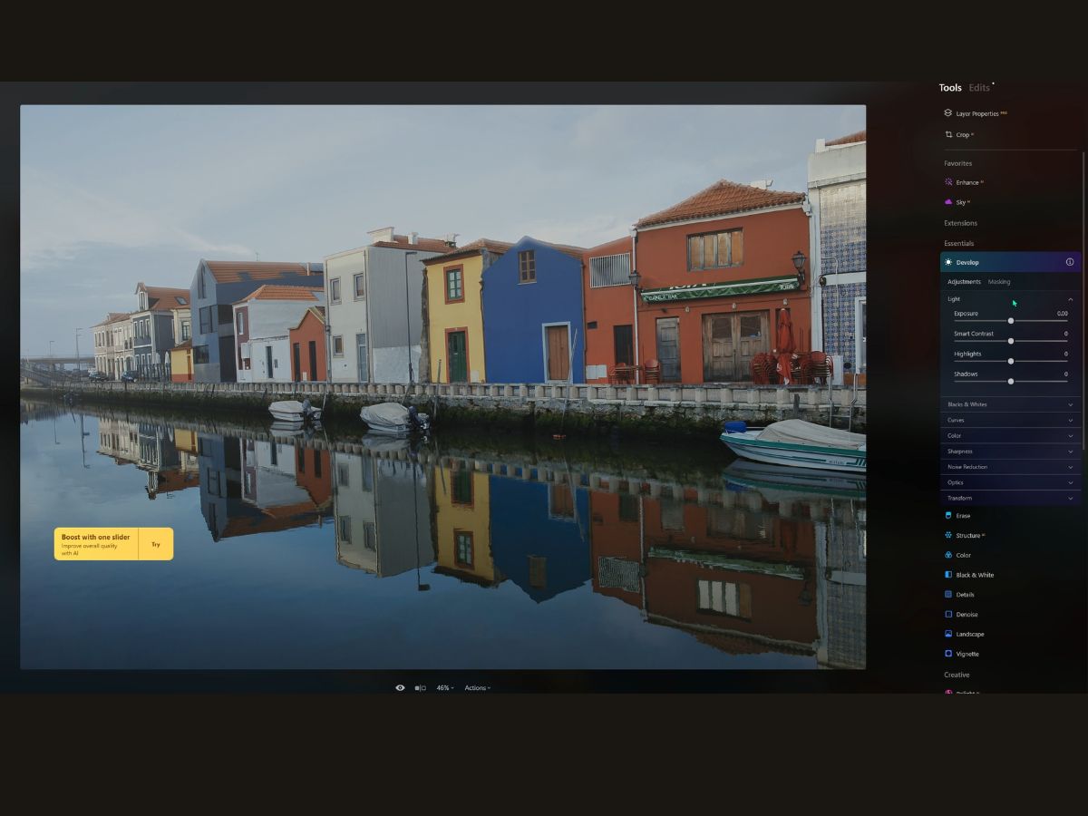
Light
It’s all about brightness and mood. Want to make your image sunnier? Slide that Exposure to the right. Feeling more like a moody, dramatic scene? Take it left. Smart Contrast is your friend when you want to make things pop without turning your photo into a grungy poster. Highlights and Shadows are where you play god with the light, either dialing up the sun or pulling the clouds over the scene.
Blacks and Whites
These are like the anchors at either end of your tonal spectrum. Push Whites to the right, and your brights get brighter; nudge Blacks to the left, and your darks dive deeper.
Curves
Oh, Curves is where you can really get fancy. It’s like bending light with your mind, pinpointing exactly where you want more drama or subtlety. Use it to tweak individual colors or the whole tonal range.
Color
It’s like the spice rack. White Balance is your salt—essential. Temperature adds warmth or coolness, and Tint can remove those weird color casts that sometimes show up.
Saturation and Vibrance? They’re like turning up the volume on your colors, either all at once or just the quiet ones in the back.
Sharpness
This is your tool for bringing things into focus. But it’s a delicate dance—too much and your photo might look sleepy. Too little, and it might feel like it’s trying too hard. Radius and Masking let you decide how much sharpness you throw around and where.
Noise Reduction
Think of it as the eraser for those pesky grains that show up when you shoot in the dark or crank up your camera's sensitivity too high. Luminosity for the grayscale noise, Color for the speckled colors.
Optics
This is like cleaning your glasses. It removes the distortions and aberrations that lenses sometimes add to our photos. Auto options for quick fixes or manual sliders are available if you like to fine-tune.
Transform
And this, my friend, is where you straighten up those wonky lines that buildings and horizons like to do when you shoot from odd angles. Vertical and Horizontal sliders will have your lines straight as rulers, and Aspect will make sure everything still looks proportional.
9. Erase
The Erase tool is like a magic brush for your photos!
Picture this: you're out capturing the perfect landscape shot, and just as you're about to pat yourself on the back for that postcard-perfect image, you spot a pesky little soda can someone left behind.
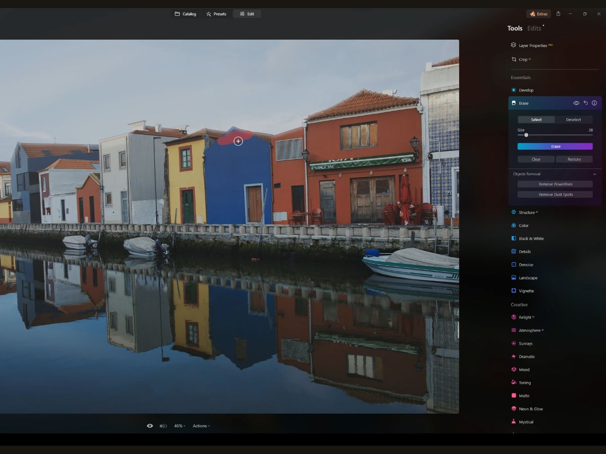
Enter the Erase tool! It's like your personal digital clean-up crew, ready to make unwanted objects vanish with just a few clicks. So, you select the Erase tool, and—voilà—the cursor transforms into a brush, ready to paint over those unwelcome bits.
As you brush over the object, it's like waving a red magic wand. The area gets this red overlay, showing you exactly what's about to disappear from your photo. If you're a bit heavy-handed and get that red overlay on something you didn't mean to erase, no worries at all! Just hit the Deselect button and brush over the oopsie to keep it in the picture.
The Size slider is pretty nifty, too. It's like choosing the right broom for the mess—you wouldn't sweep a tiny crumb with a giant push broom, right? Adjust it just right so your brush is a tad bigger than the object for a clean sweep, or use the bracket keys for quick adjustments. After your selections are made, you hit Erase, and the software does the heavy lifting. It looks around the object, analyzes what should be there instead (like grass, sky, water—you name it), and fills in the space.
And if you’re not happy with what you see, Clear Selection lets you start over, no harm done. Or if you just want to bring back the last thing you erased, the Restore button is like a friendly "undo" option.
Objects Removal
Now, let's discuss the specialized soldiers in your editing army: the Remove Powerlines and Remove Dust Spots tools. Imagine you're photographing this breathtaking landscape, but those powerlines are photo-bombing the sky.
The Remove Powerlines tool is like a sky-cleaning sniper, targeting just those lines and zapping them out. And dust spots? Those sneaky little buggers that show up from a dirty lens or sensor? Zap!
The Remove Dust Spots tool makes them history, no tedious spot-cleaning needed.
10. Structure AI
Imagine you've got this super cool photo, but it's looking a bit too… meh. You know, when the details aren't popping how you want them to? That's where Structure AI comes in—it's like the personal trainer for your photos that brings out the muscles, aka the details and textures, without making it look like it's trying too hard.
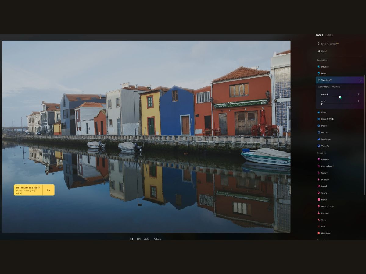
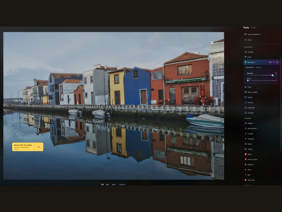
Amount Slider
So, you've got the Amount slider, right? Think of it as the dial that turns up the drama in your images.
Slide it to the right, and you're adding oomph to your photo, making every detail stand out, like sharpening the edges of a leaf or the textures in a stone wall. Slide it to the left, and it's like you're smoothing everything out for that soft-focus, dreamy vibe.
Boost Slider
But here's where it gets even cooler. The Boost slider—it's like the Amount slider's wild cousin. It takes those tiny details in your photo and turns them up to eleven. If the Amount slider is like a sprinkle of salt to enhance the flavor, the Boost is like a pinch of spicy chili flakes—it really kicks things up. Push it to the right, and you get this punchy, almost HDR effect that makes your photo look super intense.
11. Color
Alright, let’s dive into the world of color in your photos, which can be as fun as playing with a new set of paints.
The Color tool? It’s your virtual paintbrush, adding life and emotion to your snaps with just a few nudges.
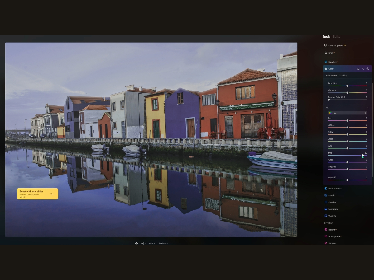
Saturation
First up, we've got the Saturation slider. Imagine every color in your photo is at a party, and Saturation is the DJ. Crank up this slider, and you’re turning up the volume, making every color dance a little harder, a little brighter.
But if you go too far, it's like that DJ blasting the music until it’s just noise—your colors might start screaming a little too loud. On the flip side, if you pull it back, you’re calming everyone down, draining the room of energy, until you’ve got a more subdued, maybe even a black-and-white photo.
Vibrance
Now, enter Vibrance, the cooler, more sophisticated cousin of Saturation. Vibrance takes a look around and sees which colors are shy, hanging back, or not really joining in the fun.
It gives them a gentle nudge, saying, "Hey, why don’t you step up a bit?" So, it boosts the intensity, but only of the muted colors, while the already party-hardy, vibrant colors don’t really change. It’s like turning up the quiet voices without making the loud ones shout, so you get a more balanced, lively picture without the wildness.
Remove Color Cast
Lastly, there’s the Remove Color Cast slider. Imagine snapping a picture inside with weird lighting, and everything has this odd blue or orange tint—like you're looking at the world through colored glasses. This little slider is your magic eraser.
It figures out what color is crashing the party and shouldn’t be there, and it gently escorts it out. This way, you get back to the true colors that should be in the photo, like fixing the lighting to a normal sunny day instead of a rave.
12. Black and White
The Black & White tool is like a time machine for your photos, transporting them back to the golden age of film. It strips away the distractions of color to reveal the soul of the image in shades of gray—sometimes more powerful than the original!
When you hit that Convert to B&W button, it’s like you’ve decided to throw a monochrome party, and all the colors are suddenly wearing their sleek black and white outfits. It's a transformation that can turn a busy, colorful scene into a study of light, shadow, and emotion.
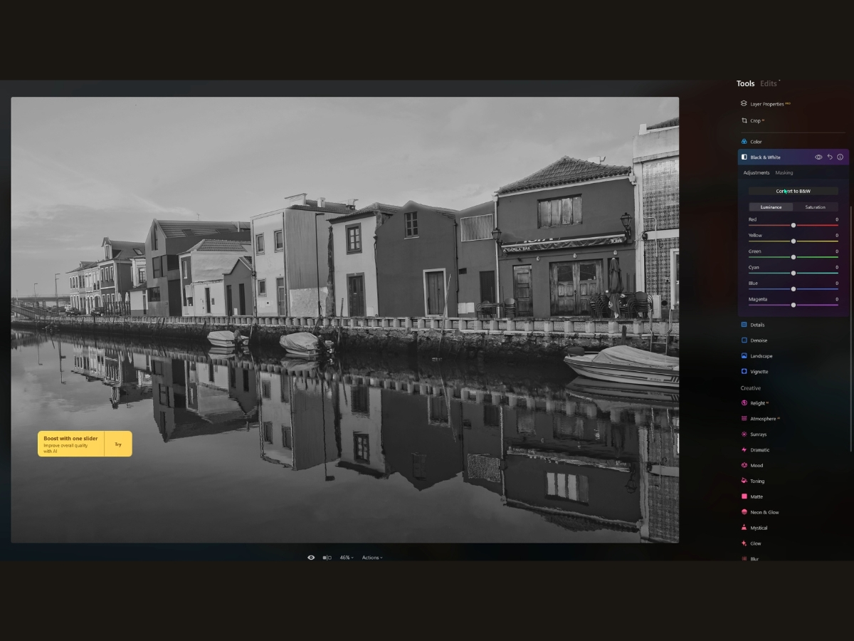
Luminance Sliders
Now, the Luminance sliders, they're a bit like the dimmer switches in your home for each color in your old photo.
Say you slide up the Red and Yellow luminance sliders. Wherever those colors appear in your original picture, they'll glow brighter in the black-and-white version. Slide them down, and those areas darken, adding depth and drama. It's about playing with these sliders to find the different shades of gray that make your image pop.
Saturation Sliders
Then there’s the Saturation sliders in the black and white realm. These are a bit like ghosts of the colors that once were. You won’t see the colors come back to life, but what you will see is their spirit, affecting the grayscale image where they used to be. These sliders let you fine-tune the intensity of those whispers of color in the black-and-white conversion.
13. Details
Let’s dive into the world of the Details tool, the secret sauce to make your photos go from "nice" to "wow, let me see that up close!" It’s like giving your image a mini-makeover without overdoing it.


For example, let's say you’ve got a photo that’s almost there, but it just needs a bit of pizzazz. That’s where the Small Details slider waltzes in. It’s like it has a magic wand for all the tiny textures and patterns that might be getting lost. A nudge to the right and you start to see everything come to life—textile weaves, grains of sand, the works! But be gentle; too much, and you might end up having a detailed party where everyone’s talking over each other.
Then, there’s the Medium Details slider. This one’s the mediator, making sure those mid-sized details play nice and get their share of attention without stepping on the toes of the small or large details. It’s your go-to for that "just right" sharpness.
For the bigger picture, you literally have the Large Details slider. This one’s for the contours and outlines that define the shapes in your image. Slide to the right, and it’s like putting the right glasses on your photo. Everything just snaps into focus.
But what about the Sharpen tool? Think of it as the final touch-up, defining those edges like a makeup artist with a fine brush. But remember, there’s a fine line between sharp and too sharp, where things start to look like they’re in a gritty detective movie.
Details Masking
Now, let's not forget about Details Masking.
You don't want to sharpen everything, right? Sometimes, like in portraits, you want the eyes crisp but the skin soft. That’s where Details Protection comes in—it’s like a selective shield that keeps the smoothing in some places and the sharpening in others.
Sharpening Masking
And for the pièce de résistance, Sharpening Masking lets you pinpoint exactly where you want those crisp edges. Want to keep the background dreamy and soft? That is no problem. Just mask the sharpening effect so it only gives extra clarity to your subject.
A little tip for those who want to tread lightly: A Details setting of 30 to 70 is often the sweet spot, giving you that clarity without stepping into the territory of overcooked. Lastly, for those moments you want to go the opposite direction, say for a dreamy portrait or a landscape that needs a softer touch, pull those sliders into the negative.
It’s like a soft-focus lens effect minus the fancy lens.
14. Denoise
The Denoise Tool is like the superhero of photo editing when it comes to battling the evil villains known as noise and grain that sneak into your photos.
Picture this: you've taken a shot in low light, cranked up the ISO, and now your image buzzes with more static than a TV tuned to a dead channel. Enter the Denoise Tool, cape billowing in the wind, ready to smooth things over.
Luminosity Denoise Slider
The Luminosity Denoise slider is your go-to for tackling that pesky gray static that marries your image's smooth vibes. Imagine it as a kind of digital vacuum cleaner, sucking up all the fuzzy bits that shouldn't be there.
Color Denoise Slider
Then there's the Color Denoise slider. Do you know when you look really closely and see those weird purple and green specks like a bunch of tiny aliens decided to throw a rave in your photo?
Well, the Color Denoise slider tells them the party’s over and sends them packing. Here's the thing, though—you’ve got to be a bit of a smooth operator yourself.
If you press too hard on the sliders, you might end up with a photo that's as flat as a pancake. The trick is to slide just enough to keep things looking natural. For example, when you're seasoning a dish, you don’t want to overdo it with salt.
15. Landscape
Whether you're a pro landscape photographer or just someone who loves snapping pics of nature while out and about, the Landscape Tool is like having a little landscape wizard in your pocket.
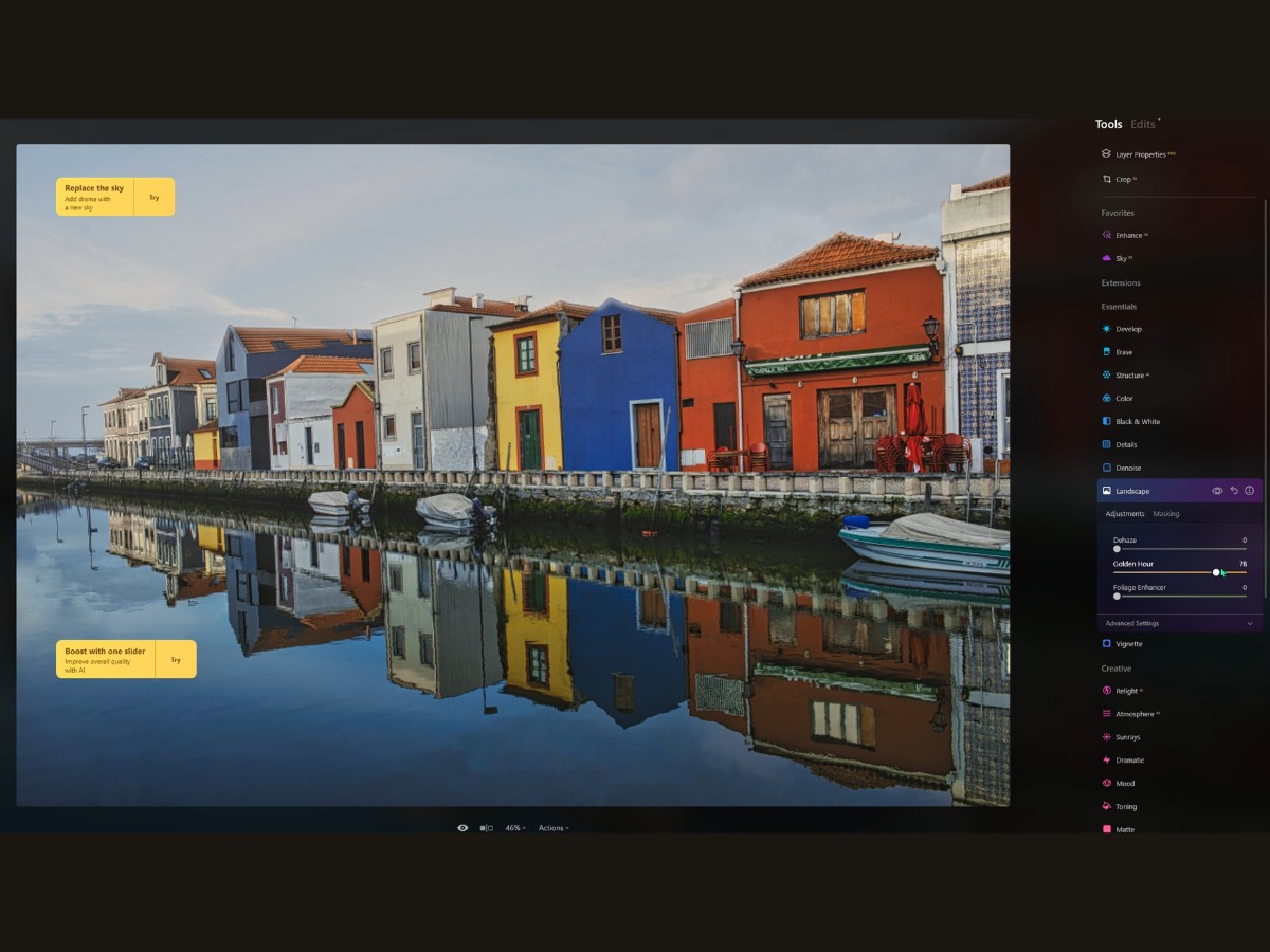
Dehaze Slider
So, you've taken a photo of a breathtaking scene, but it’s come out looking like it's been steam-treated, like a window on a rainy day. That’s where the Dehaze slider comes to the rescue. Slide it over to the right, and it's like the sun breaking through the clouds, banishing all that fog and haze to reveal the crisp, clear landscape beneath.
Golden Hour Slider
Then there's the Golden Hour slider. Oh, this one is like a time machine. Missed that perfect light just after dawn or before sunset? No worries. With a nudge of this slider, your photos will be bathed in that warm, golden glow that makes everything look like a scene from a romantic movie. It's instant "good lighting" in a slider.
Foliage Enhance Slider
And let’s not forget the Foliage Enhancer. You know how sometimes you take a photo of a lush forest or park, and somehow, it just doesn't pop like it did in real life? The Foliage Enhancer is your best bud here. It's like it tells every leaf, "Hey, show 'em your best side," bringing out those vibrant, lively greens that make your photo look like Mother Nature herself just hit the refresh button.
16. Vignette
Picture this: you've just snapped a photo that has all the right elements—a compelling subject and a beautiful background—but it's missing a certain je ne sais quoi.
Enter the Vignette tool, the photo equivalent of a spotlight on a stage, drawing your eyes to the star of the show.
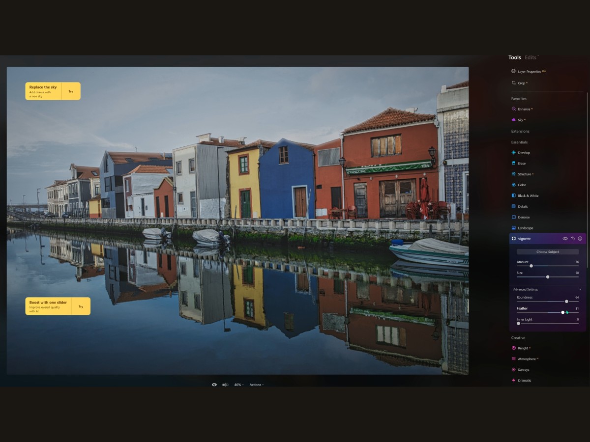
Choose Subject
Now, this isn't just your grandma's vignette, where the edges get a basic darkened curtain. Luminar Neo lets you play director with your photos, spotlighting your subject with precision. You start with the Choose Subject button, which isn’t just a button; it’s like the fairy godmother of your photo editing tools.
Click it, and you summon a crosshair to pick exactly where you want your audience to look. Want the vignette off-center? No problem. It's as if you're telling the edges of your photo, "Shh, calm down a bit; let's keep the focus on the star."
Amount Slider
Then you've got the Amount slider. Drag it to the left, and you add a subtle (or not-so-subtle) shadow around the edges, like dimming the lights in a theater. Drag it to the right, and it's like the sun's coming up over the horizon, lightening up the border and maybe giving a whole new mood to your picture.
Size Slider
Size matters, of course, especially with vignettes. The Size slider is basically your zoom lens for the effect. Pull it one way, and your vignette will wrap around most of your photo like a cozy blanket. Tug it the other, and it retracts, focusing more on the central showpiece.
17. Relight AI
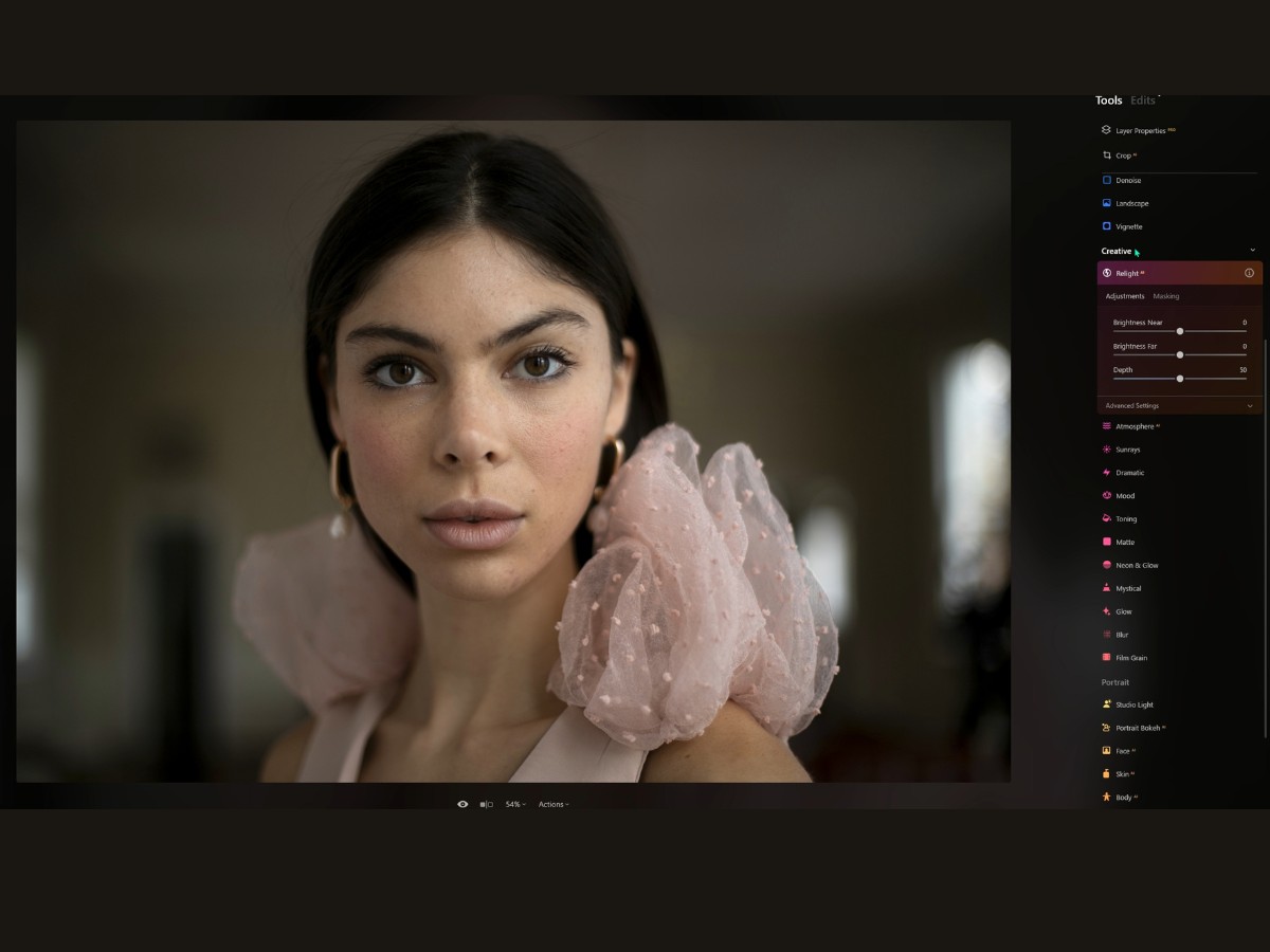
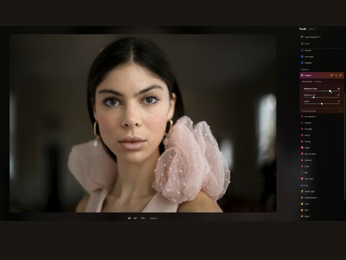
Do you know how sometimes you snap a picture, and the lighting just doesn’t do the scene justice? Maybe the front looks too dark, or the back is just lost in the shadows. Well, RelightAI is here to save your shot.
Brightness Near Slider
Imagine being able to reach into your photo, grab the sunlight, and drag it to exactly where you need it. That’s your Brightness Near slider. Slide it up, and it’s like the dawn is breaking right in front of your eyes, bathing the foreground in light. Slide it down, and you set a more somber mood, letting the shadows claim the space.
Brightness Far Slider
Now, look off into the distance — that’s where the Brightness Far slider comes into play. It’s like having a dimmer switch for the horizon.
If your background is competing with the front for attention, dim it down a notch. Or, if it's looking like an afterthought, crank it up and watch the background glow up.
Depth Slider
The Depth slider is your secret weapon. It's what makes RelightAI smarter than your average tool. It doesn't just blanket your photo with light; it considers how far things are in the scene. Slide it around, and you'll see the light creep forward and backward like you’re directing the tides.
18. Atmosphere AI
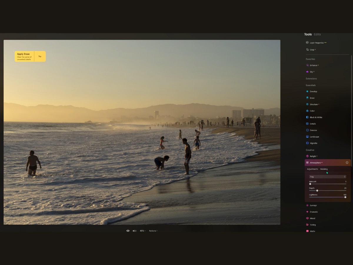
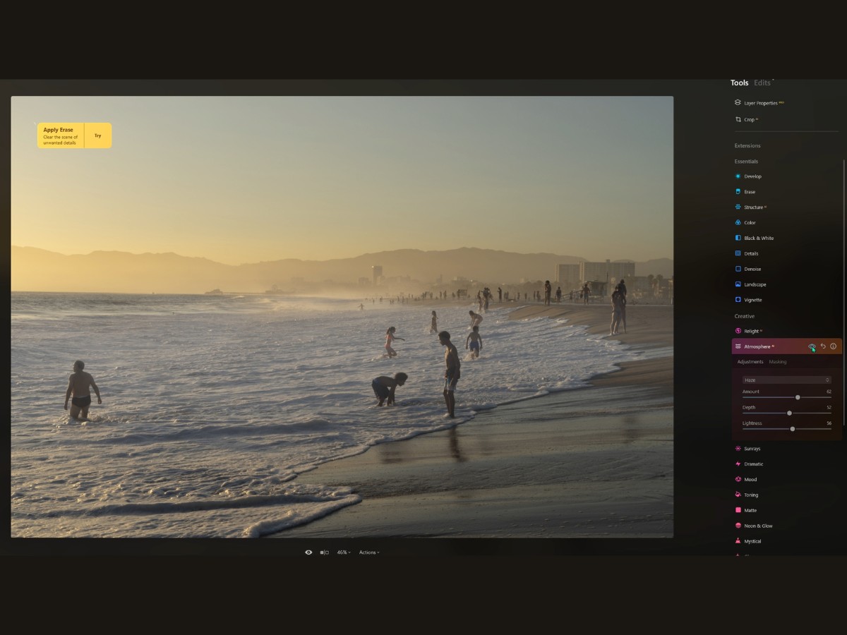
The Atmosphere AI tool is like being able to control the weather inside your computer. Ever look at a landscape shot and think, “You know what this needs? A touch of Stephen King-esque mist!” Well, that’s exactly what this tool does. It’s like having a special effects team in your back pocket.
You pop open your photo and think it's looking pretty good but kind of ordinary, right? Then you hit that drop-down menu, and boom – you’ve got options.
Fog gives you that classic look, like the morning’s first breath over a lake.
Layered Fog is more like rolling clouds creeping over hills, perfect for adding drama.
Mist is subtle; it’s that light kiss of fantasy that makes your image look dreamy.
And Haze? Well, that's your summer afternoon heatwave right there.
Amount Slider
Now, the Amount slider is straightforward – it’s your “how much” gauge. Crank it up to make your scene look like the set of a horror movie, or dial it back for a hint of a chilly morning.
Depth Slider
Depth is where things get cool – literally. This slider is like your 3D glasses for the effect. Slide it one way, and the mist comes rolling towards you; slide it the other, and it gently settles into the back of your scene. It’s all about where you want your viewer to feel the atmosphere.
Lightness Slider
And the Lightness slider, that’s the mood setter. Want your fog to feel heavy and ominous? Take that slider down a notch, and you’ve got yourself some serious mood. Keep it up high, and it’s a light, ethereal blanket over your landscape.
19. Sunrays
It’s almost perfect, but you know what it's screaming for? Some good old Vitamin D. Yep, I’m talking about sunshine! That's where the Sunrays tool strides in, like the cool aunt at a family BBQ who changes the whole vibe of the party.
So, first off, we've got this nifty thing called 'Place Sun Center.' It’s as if you have the power to command the sky. Want the sun peeking from behind a tree? Boom, done. Prefer it to be chilling off the edge of the canvas like it’s shy? You got it. Just click and drag that sun wherever your heart desires.
Now, the Amount slider is basically your dimmer switch. Crank it up, and it's like, “Hello, Sahara Desert!” Pull it back, and it's more like a soft morning glow that’s just right.
'Overall Look' – this slider is like your photo’s personal trainer. It pumps up the brightness, making everything look more alive. And if your photo had muscles, they’d be popping.
'Sunrays Length' and 'Penetration' are where things get sci-fi. You slide 'em around, and you control how far those beams of light stretch and how much they want to show off by cutting through clouds or mist.
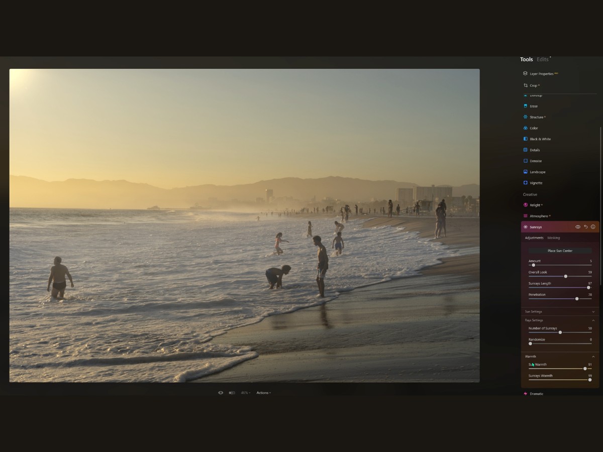
Sun Settings
Diving into the Sun Settings, we've got the 'Sun Radius,' which is basically deciding whether you’ve got a sun that’s a cute little dot or a big, bold statement.
'Sun Glow Radius' and 'Sun Glow Amount'? They're like the entourage that makes the sun look epic, giving it that halo effect that says, “I’m the star of this show.”
Rays Settings
Then there’s the Rays Settings.
'Number of Sunrays' lets you decide on the fan club – how many rays do you want following the sun’s lead?
And 'Randomize' is your wild card. Don’t like the hand you’re dealt with those rays? Hit Randomize, and it's a whole new game.
And let’s not forget about Warmth. 'Sun Warmth' gives your sun that cozy, golden-hour feel or keeps it cool if you’re not into that whole ‘Instagram influencer at sunset’ vibe.
'Sunrays Warmth' adjusts the rays themselves—are they going to be hot on a summer’s day or cool on a winter morning?
20. Dramatic
All right, so let's chat about the Dramatic tool – it's like the Hollywood director of your editing tools, giving your photos that blockbuster movie feel.
You know when you see those super intense movie scenes, where the colors are all moody, and the shadows are deep, and everything looks so, I dunno, dramatic? That's what this little gem does to your shots. It's like adding an edge, a bit of attitude. It's the difference between a clean-cut hero and a mysterious stranger with a past.
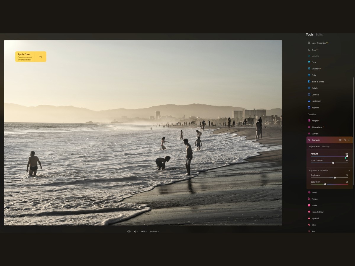
Amount Slider
So you start with the Amount slider, right? This guy is your main dial, your volume control for drama. Crank it up, and your photo goes from "Oh, that's nice," to "Whoa, what's the story here?" It pulls back the color, making it less about the rainbow and more about the feels.
Local Contrast Slider
Then you've got the Local Contrast slider. This one's like the fine-tuning knob on an old radio – it brings out the textures and the grit. It sharpens up those little details that make your viewers lean in closer because they just can’t help but want to see more. Now, if you think your dramatic masterpiece is going a bit too dark, you nudge the Brightness up. It’s like opening the curtains on a dark, stormy day – suddenly, there's detail in the gloom. But if it’s the apocalypse scene you’re going for, then hey, turn that brightness down and let the shadows take over.
And finally, Saturation. It's like deciding how much spice to add to your dish. Do you want those colors muted and understated, like a bleak dystopian wasteland? Or do you want just a hint of color seeping in, like the sun after a thunderstorm?
21. Mood
Imagine you've just stepped into the control room of your very own visual style lab – that's what playing with the Mood tool feels like.
It's like having a magic wand that can instantly transform the vibe of your photo. One flick, and bam! You're not just tweaking colors; you're setting the whole scene. So, the Mood tool is basically your go-to DJ booth for color tunes, with LUTs being your epic soundtracks.
LUTs, or lookup tables, are these super cool presets that can replicate film effects or create entirely new color schemes. Think of them as Instagram filters on steroids. You'll find a treasure chest of these LUTs right there in the Choose LUT menu. It's like flipping through a vinyl record collection, but for your photos. From vintage vibes to modern blockbuster feels, there's a whole spectrum.
And hey, if you're the creative type who's cooked up your own LUTs, you can bring those to the party, too – just load them up and see your vision unfold.
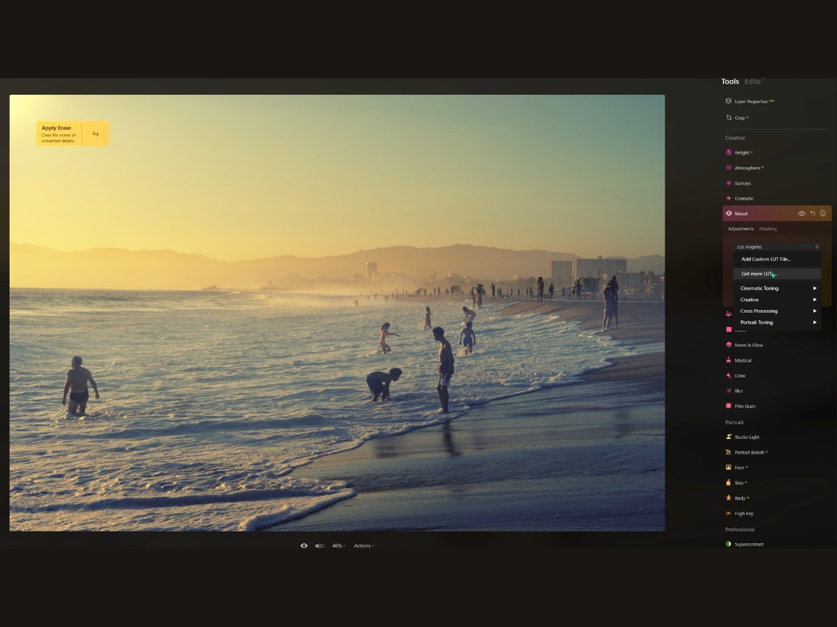
Amount Slider
Now, the Amount slider is your volume control. Maybe you want a subtle hint of that cinematic feel, or perhaps you're going all out for a full transformation. Slide to the right for more intensity, or pull it back when you want just a whisper of change.
Contrast Slider
Got the look, but do you need to fine-tune the drama? That's what the Contrast slider is for. It's like adjusting the bass and treble – you either pump up those dark-lights dynamics for some punchy visuals or you tone it down for a softer, more blended look.
Saturation Slider
And finally, the Saturation slider. It's like the saturation soul of your photo. Want colors that pop and sizzle? Crank it up. Or maybe you're going for something more understated, a scene that's all about the mood and not the loudness of colors. Then you just dial it back.
22. Toning
Imagine your photo is a piece of music, and with the Toning tool, you're there to fine-tune the melody so everything flows together just right.
Amount Slider
The Amount slider kicks things off. Think of it as your master volume knob. It controls how strong the color toning in your photo is going to be. Slide it up, and you're turning up the color volume, giving those tones more voice. Pull it back, and you're whispering the hues softly into the image.
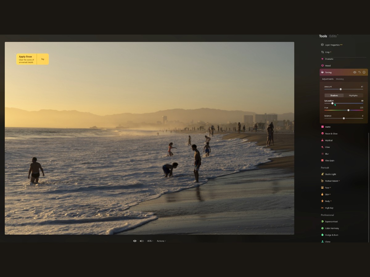
Highlights
Now, let's chat about the highlights – the high notes in your visual symphony.
With the Saturation slider under Highlights, you get to decide how rich and vibrant the brightest parts of your image are going to be.
Do you want them to sing loud and proud? Or should they hum gently in the background? Then, with the Hue slider, you’re picking the color of your high notes. Which color is going to play the solo? Is it a warm, sunny yellow or a cool, calming blue?
Shadows
Diving into the shadows, you’ve got a similar duo.
The Shadows Saturation slider lets you add depth and mood to the darker areas, like the bass in your photo's melody.
And the Shadows Hue? That's picking the tone for the deeper parts of your image. You're painting with shadows, adding a subtle blue to give it a cold night vibe, or maybe a brown for a touch of sepia nostalgia.
Balance Slider
And finally, there's the Balance slider. It's your mixing board where you decide who gets the spotlight – the highlights or the shadows. Slide it one way, and your image might start to feel like a bright summer day. Slide it the other, and you're in a dimly lit jazz club.
23. Matte
The Matte Tool is a cool feature that can take your images back to the days of old film cameras with a single swipe.
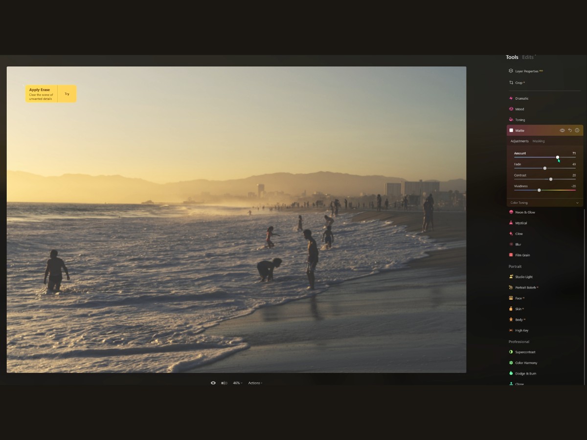
Amount
The Amount slider is your main dial. It’s what you use to decide how strong you want this vintage vibe to be. Crank it up, and you're diving into a world where colors are subdued, and everything has that classic, nostalgic feel. Dial it back, and it's like you're just lightly brushing your photo with a bit of the past.
Fade
Now, the Fade slider is a bit like fogging up the scene with your breath. It's how you lose the crispness in the shadows, giving them this soft, faded look – as if some of the details are slipping away into a misty memory.
Contrast
Contrast is where you get to play with drama. Adjusting this slider is like adjusting the tension in a movie scene. High contrast brings stark differences between light and dark while toning it down makes everything look more gentle and mellow.
Vividness
Then you've got the Vividness slider. It’s a bit like deciding how rich the colors in an old film photograph are. Do you want them to be bold and somewhat present or washed out like they've been sitting in the sun for a few decades?
24. Neon & Glow
Alright, picture this: you've just captured the perfect shot, but you think it could use a bit of razzle-dazzle, a little bit of that '80s neon vibe, or maybe a mystical glow like the halo around the moon.
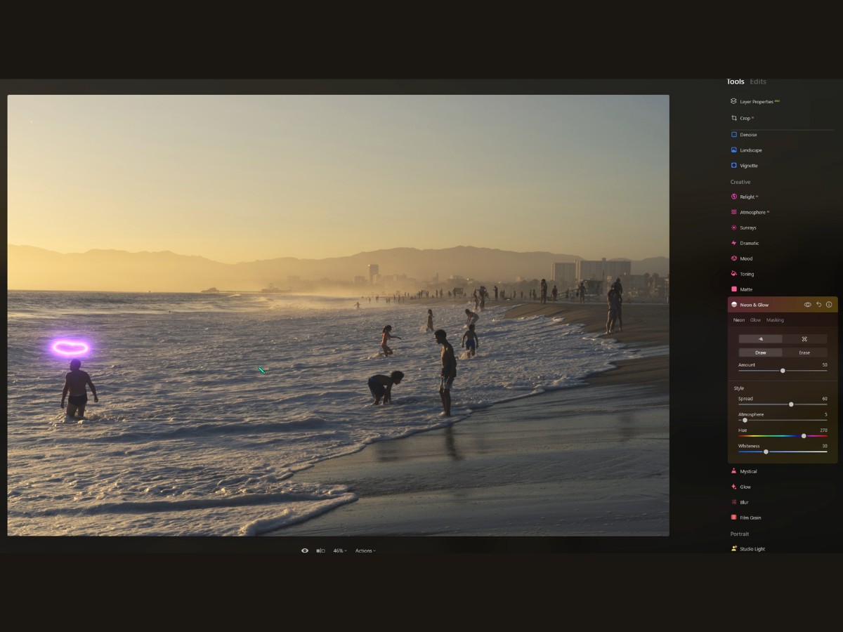
That's where the Neon & Glow Tool comes into play! It’s like a magic wand for your photos, adding that touch of fantasy and creativity. Starting with the Neon part – think of it as your digital neon paint. You can get really artsy here.
Want to add some electric glow to the outlines of a car or make your friend seem like they're holding a lightsaber? Just grab the “Draw” tool and scribble away. It’s like lighting up your photo with virtual neon lights.
And if your hand slips, no worries, the “Erase” tool is like an eraser for your bright neon mistakes.
Now, let’s say you’re not into manual drawing and want to go the easy route – that’s where the "Automatically Select Object" feature comes in handy. It’s like telling your software, “Hey, make that guitar in the picture glow,” and bam, it does it. But it's not just a blunt tool; you can refine your selection, tweaking and tuning until you’ve got the perfect neon outline.
When you're styling your neon, you’re essentially controlling the visual party. Spread sets how much your neon diffuses into the scene.
Atmosphere is all about setting the mood; maybe you want a foggy night look?
Then there's Hue, which is your color palette – electric blues, hot pinks, whatever floats your boat.
And Whiteness? That's how you get that pure, bright neon look or tone it down for something subtler.
Switching gears to the Glow section – this is like the inner and outer aura of your subject. The “Inner Glow” adds this ethereal light from within, sort of like the subject is glowing with magic. The “Outer Glow” is more like a halo or a soft shadow of light around the subject, making it pop out from the background. For both Inner and Outer Glow, you’ve got sliders to control the intensity, color, and reach of the glow.
Brightness and Contrast sliders are there to make sure the glow doesn’t overpower the photo or gets lost in it.
And the Background slider? That’s to ensure your subject doesn’t float away in all that glow. You can adjust the background brightness to keep the scene grounded.
25. Mystical
You know those images that look like they've been plucked straight out of a fairytale? That's the magic Mystical tool can weave.
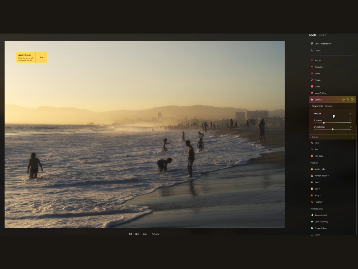
Amount
First up is the Amount slider. Think of it as your dial for enchantment intensity. A little twist to the right, and you start to see the scene transform. Keep it below 40, and you've got that "Is this place real?" question lingering in the viewer's mind. Crank it up, and boom, you're in full-on fantasy land.
Shadows
Then there's the Shadows slider. It's like tiptoeing into the darker parts of your image and lifting the veil of mystery ever so slightly so you get just enough detail without spoiling the mood. It's about finding that sweet spot between 'lost in the shadows' and 'here's where the magic hides.'
Smoothness
The Smoothness slider, oh, that's a subtle one. It’s like you're smoothing the edges of reality, making everything blend together in a soft, dream-like way. High values here make for a gentle transition from the mystical parts of your image to the normal ones, like a soft fade-out in a movie scene.
26. Glow
Let's say you've snapped a shot of the city at dusk, and it's nice, but you want those streetlights to really sing, or you want that twilight sky to feel like it's got a pulse.
That's where the Glow tool struts in like a maestro of light.
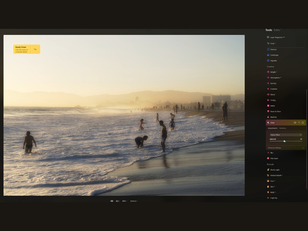
Standard Settings
You open up the Standard Settings, and it's like walking into a boutique of light. You've got this neat little drop-down menu called Type, with a buffet of glow effects to feast on—Soft Focus, Glow, Orton Effect, and Orton Effect Soft. Each one's got its own flavor.
Soft Focus gives you that gentle, romantic haze, while the Orton effects are like sprinkling fairy dust on your image, making everything feel a bit more magical and deep.
Then there's the Amount slider, which is pretty straightforward. Imagine it's a dimmer switch for your glow. All the way to the left, and it's like it's not even there—zero, zilch, nada. Slide that baby to the right, and you're amping up the intensity, like turning up the volume on your favorite tune.
Advanced Settings
But wait, there's more! Advanced Settings is where you get to fine-tune the glow to get it just perfect. Softness is all about the blend. Crank it up, and your glow goes all smooth and silky, fading into the rest of the picture like a whisper. It's all about that seamless transition.
Brightness? Well, that's like deciding how much the lights are going to shine in your photo. You're playing with the lumens here, making your glow dim or bright as you see fit.
Now, the Contrast slider in the Glow tool—it's a bit like adding definition to your glow. Slide it one way, and your bright areas start to pop, creating a bold statement. Slide it the other way, and it gets softer, more like a gentle hum.
Warmth is where you decide the mood. Slide toward the cooler end, and your image might start to feel like a crisp winter morning. Slide towards the warmer tones, and it's all sunsets and candlelight vibes.
27. Blur
Imagine you've got this photo, and it's pretty cool, but you want to crank up the art factor. That's where the Blur tool comes into play, like a magician's wand for photographers.
Let's chat about the four types of blur it offers: Gaussian, Motion, Twisted, and Tilt-Shift. Each has its own secret handshake with your photo, and knowing how to use them? That's pure gold.
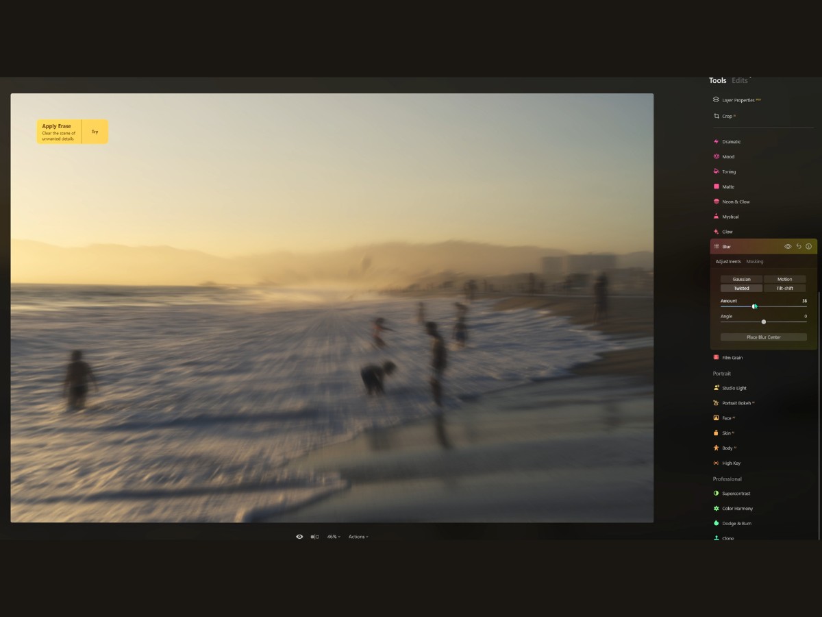
Gaussian Blur
Gaussian Blur is like the chill friend who knows how to smooth over any situation. It doesn't ask questions; it just softens the rough edges and makes everyone look good. You've got this distracting background, right?
Slap on some Gaussian Blur, and boom, it's like your subject is stepping out of a dream. And with a little masking action, your subject stays sharp—like a lead singer under a spotlight.
Twisted Blur
Now, onto Twisted Blur. This one's the life of the party—think of it as your photo doing a merry-go-round. It's for when you want to add a bit of fantasy or a sense of movement to an otherwise static scene. You crank that Twisted Blur up, and your image starts dancing in circles. But remember, you're the choreographer, so mask out the bits you want to keep from joining the conga line.
Motion Blur
Ready to feel the need for speed? Motion Blur is your go-to. It's perfect for making anything static look like it's moving faster than a kid after an ice cream truck. It adds energy, velocity, and a touch of "whoa" to your images.
Apply it, stretch that layer, and maybe dial down the opacity. Suddenly, you've got a still photo that's telling a story of speed and hustle.
Tilt-Shift Blur
Finally, there's Tilt-Shift. Ever wanted to make the real world look like a toy set? That's Tilt-Shift's superpower. It blurs the heck out of the top and bottom of your photo, keeping a strip of reality in sharp focus. It's like looking at life through a miniaturizing kaleidoscope. And it's not just for looks—this technique can also help you focus on what's really important in the photo by blurring out the noise.
28. Studio Light
Alright, so you've got this photo, and you're thinking, "Hmm, this could use a little oomph, a little drama, a bit of that 'struck by a beam of heavenly light' vibe." Enter the Studio Light portrait tool! It's like having a pro lighting rig at your fingertips without all the hassle of, you know, actually having a pro lighting rig.
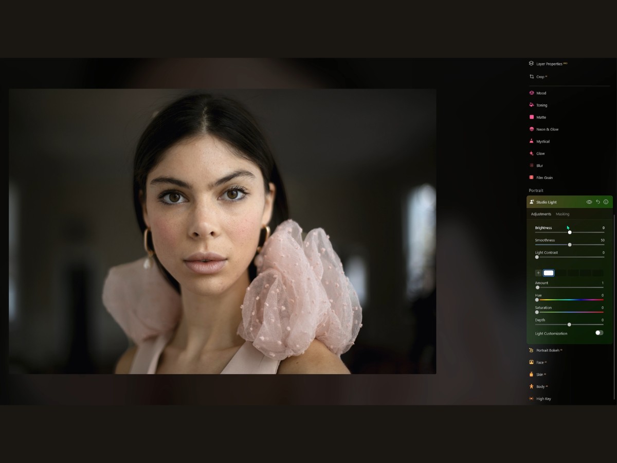
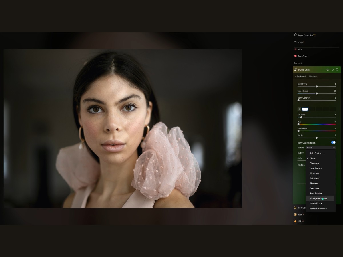
You start dabbling with the Studio Light settings, and it's like turning knobs and sliders on a high-end audio system. You bump up the Brightness just a notch, and suddenly, your subject's got that glow like they're in the spotlight. Too much shadow? No problem! Smooth out those shadows to make everything look, well, smoother.
And the Light Contrast? Crank that up, and you've got a definition, baby. Those highlights and shadows start to pop, giving you that crisp, cinematic look.
Want to go for that moody, dim-lit atmosphere? Drag that Brightness down, and watch your photo get all mysterious and intriguing. Now, say you want more light sources because, why not? You hit that plus icon like you're ordering fries with your burger.
Boom, a new light source. And guess what? You can move that little light pin around, watch the shadows dance, and position that glow right where you want it.
But wait, there's more! You can color your lights. Feeling blue? Slide over to a cool hue. Want warmth? Dial-up to a sunny yellow. The Saturation lets you decide how rich that color is going to be—like choosing between a light watercolor wash or a full-on oil painting.
Let's not forget the Depth setting. You can sharpen or soften the light pattern, making it as subtle or as pronounced as you like. It's the difference between a gentle sunrise and the noonday sun blazing down.
Now, you're thinking, this is great, but let's jazz it up even more. So, you go ahead and add a second light source. Maybe this one's for a soft fill light, just a hint to lift the shadows. Or go for broke and slap a third light in there.
Put a splash of color on the backdrop, maybe something to make your subject's hair shine or eyes sparkle. And you know what's cool? You can customize each light individually. Pick a pattern—strips, dots, stars, whatever floats your boat. Scale it to the size you want, and position it just right. It's like having all these mini light techs at your beck and call.
29. Portrait Bokeh AI
The Portrait Bokeh AI tool is like having a magic wand that turns your average Joe camera into a high-end portrait machine. Usually, getting that creamy, dreamy background blur (that's the "bokeh" we're talking about) means shelling out big bucks for fancy lenses and mastering the art of shooting with a wide-open aperture, like ƒ2.0. But not anymore! So you've snapped a picture, and the background is, well… let's just say it's more "meh" than "wow."
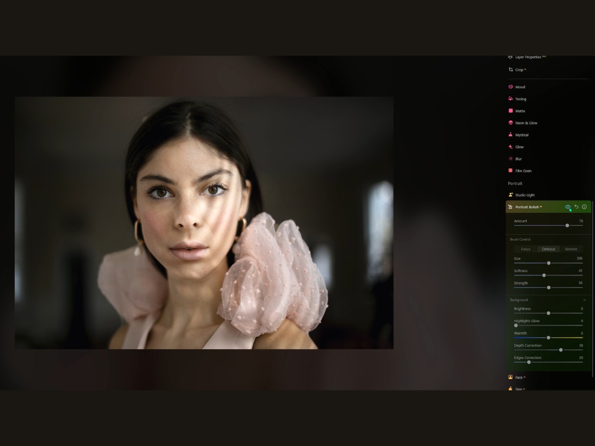
You open up Luminar Neo, slide into the Portrait BokehAI Tool, and bam! It's like you suddenly swapped lenses to the good stuff. Crank up that Amount slider, and watch the AI do its thing. It's like it's got x-ray vision, picking out people from the background—even if they're doing the hokey pokey in a group—and giving you that soft, blurred background that makes your subject pop.
But wait, sometimes the AI gets a little overzealous, right? It's cool. You've got brushes. Grab the Focus brush to keep all the good stuff sharp and in the limelight.
Need to blur out that photo bomber? The Defocus brush is your new best friend. And if you've got a case of "Oops, didn't mean to blur that," the Restore brush is your ctrl+z in brush form. As you're brushing, you're painting the town red—literally.
That ruby lith overlay shows you what's staying crispy and what's getting the blur treatment. Want to keep that overlay handy? Hit the / key, and it sticks around like a faithful puppy, showing you the Focus and Defocus areas. Now, these brushes aren't just a one-size-fits-all deal.
Oh no, you've got options. Radius, Softness, Opacity—tweak them to your heart's content. It's like being the DJ of your photo, mixing the track to perfection. And hey, shortcuts! "[" and "]" keys will size your brush up and down faster than you can say "bokehlicious," and Shift + [ or ] will soften that brush like a pro.
But the fun doesn't stop there. You've got Background controls that let you fine-tune the bokeh. Make it brighter, throw in a glow, cool it down with a blue tone, or warm it up like a summer sunset. You're the artist, and these sliders are your palette.
The Depth Correction slider? That's where things get really cool. It's like deciding where the blur begins, which can totally change the vibe of the photo.
And Edges Correction is your detail ninja, sneaking in to make sure everything blends just right, especially around tricky spots like hair.
30. Face AI
Picture this: you've got a great portrait, but the lighting is as flat as a pancake on a plate. Enter Face AI.
Crank up the Face Light slider, and boom, it's like you've just shined the perfect amount of light right onto their face. It's subtle, it's natural, and it doesn't mess with the rest of your scene. You're now an illumination guru.

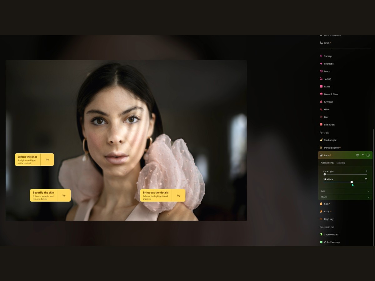
Now, let's talk about the Slim Face feature. Maybe the camera added ten pounds, or perhaps the lens was a little unflattering. Slide that Slim Face control and you can gently sculpt the face to knock off those camera pounds. It's like they spent a month at the gym, but all you did was move a slider. Magic? Pretty much!
Moving on to the windows of the soul—the eyes. With Iris options, you can turn those peepers into sparkling gems. Want to switch up the eye color? No need for contacts. Choose from a spectrum of colors, from natural shades to something more… feline? Yeah, you can even give them cat eyes because why not?
But what's color without a little sparkle? Iris Flare adds that glint, making the eyes look lively and bright. And if your subject was squinting into the sun, Enlarge Eyes is your best friend. It's like they had a double shot of espresso, and their eyes are wide open to the world.
For those who've had a few late nights, Dark Circles Removal is a lifesaver. Swipe away the shadows, and it's like they had a full eight hours of sleep. Red Eye Removal? It's the digital version of "No more tears."
And for the final touch, Improve Eyebrows thickens and darkens them to frame those newly sparkling eyes just right.
Now, let's not forget about the smile. The mouth is just as important, right? Lips Saturation, Redness, and Darkening sliders are your lipstick kit. No need to reapply; just slide to the perfect shade and intensity.
And to finish off with a Hollywood smile, Teeth Whitening turns up the wattage of any grin.
31. Skin AI
Imagine you’ve got a picture of someone who's looking great, but the skin… well, it's having a bit of a day. That's where SkinAI comes in—it's like a digital dermatologist mixed with a dollop of fairy godmother.

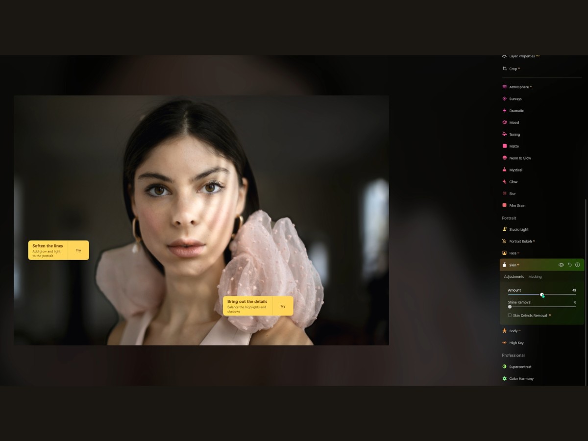
This nifty tool in Luminar Neo is all about making skin look its Sunday best. You see, SkinAI is like that friend who spots you before a big date and says, "Let me fix you up." With a simple slide to the right on the Amount, you're smoothing out the rough patches, evening out tones, and keeping everything looking natural.
And it’s not like those old-school airbrushed photos where everyone's face looked like a plastic doll. Nope, this keeps all the good stuff, like hair and eyelashes, sharper than a new set of knives.
And then there’s the Shine Removal. Picture someone with a forehead so shiny you could check your reflection in it—not ideal, right? Slide that little control and you'll be mattifying your skin like a pro makeup artist.
No more looking like someone just ran a marathon when they were just sitting for a portrait. But hold up, what about those little blemishes?
SkinAI has a trick up its sleeve for that, too. A checkbox called Skin Defects RemovalAI is like a magic wand for zapping away pimples, freckles, moles—whatever you feel like shouldn't be crashing the party.
32. Body AI
The Body AI tool, the virtual personal trainer within Luminar Neo's, is all about sculpting the torso and abdomen in photos. Now, before we dive in, it's worth mentioning that every body is beautiful, and these tools are just there for those who want to play a bit with proportions.
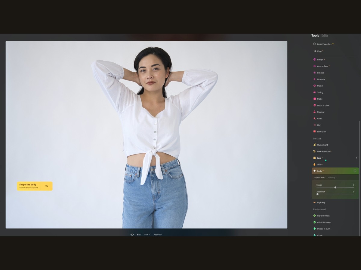
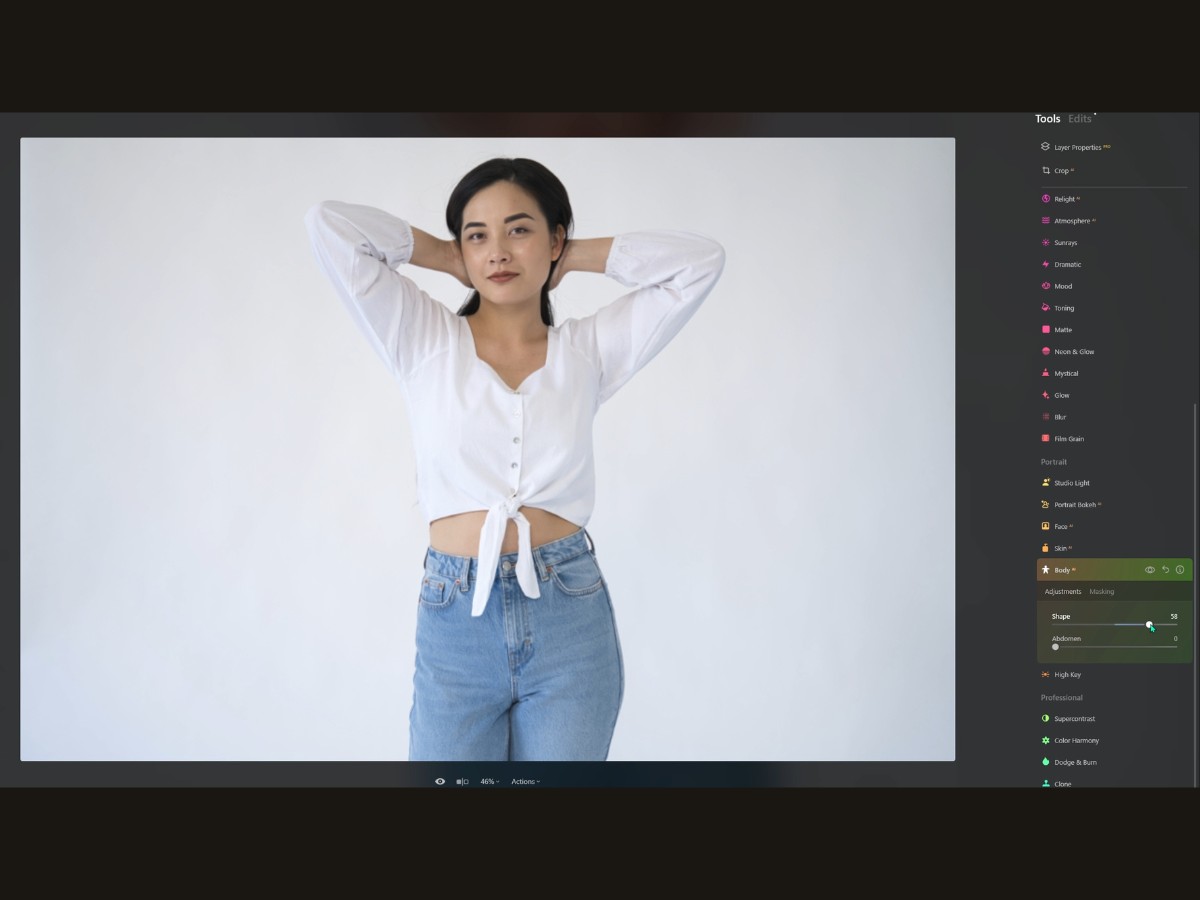
Think of the Body slider as your go-to for a quick silhouette tweak. A little slide to the left, and it's like your subject spent extra time at the gym, with a more sculpted torso. Slide to the right, and you’re adding a bit of volume, which can be great for filling out a jacket or making a superhero costume look a tad more heroic.
Then there's the Abdomen slider. This one's all about the midsection. Nudge it gently, and you can smooth out a belly, tailor a tight dress, or just reduce a food baby from that big lunch. It’s like a subtle nudge to say, "Hey, let's just tuck this in a bit."
Now, the trick with BodyAI is finesse. It's super tempting to go slider-happy, but the key is subtlety. You want to make sure that your subjects still look like they live on planet Earth with normal human anatomy. Using BodyAI can be a bit like having Photoshop-level skills without spending hours learning all those complicated techniques.
Just a couple of sliders, and you're subtly reshaping bodies in a believable, natural-looking way. It’s perfect for those who might want to tweak their photos for a little extra confidence boost or just to see what a different physique might look like in a snap. So, whether you're going for a realistic touch-up or getting creative with your portraits, BodyAI has got your back (and front!).
Just remember, it’s all about creating an image that makes you or your subject happy while keeping things real—digital enhancements should be like makeup, not a mask.
33. High Key
The High Key tool is like the photo equivalent of that fresh, dewy makeup look that's all the rage. You know, the one that's just perfect for that dreamy, airy Instagram aesthetic.
High Key lighting is like sunshine in a bottle—it brightens everything up and gives it that glossy magazine finish.
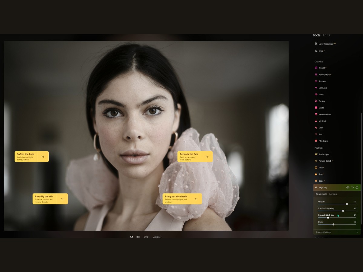
So, the amount slider is your dial for that "just stepped into the limelight" vibe. Crank it up, and your subject looks like they're on the cover of Vogue, with that softly overexposed look that screams high fashion.
But if you go too far, they might just vanish into the light, so you gotta find that sweet spot. The Standard High Key slider is like your baseline. It's gonna splash that light all over the photo.
But if you don't want your subject looking like a ghost, you switch to the Dynamic High Key slider. It's a bit of a smart cookie because it knows that you want to keep those skin tones looking natural, even while everything else is hitting the high notes of brightness. Now, if you're thinking, "But what about the drama? The mood?"
That's where the Blacks slider comes into play. It's like putting shadows back into a too-bright room, keeping your feet on the ground while your head's in the clouds of light.
And then you've got the Advanced Settings for all the fancy footwork. Glow is your halo control. A little tweak will give your subject that backlit-by-angels look. Too much, though, and they might just ascend to heaven on the spot.
Contrast is the slider that says, "Let's keep things interesting," making sure your photo has got depth and dimension, even with all that light bouncing around. Lastly, Saturation is where you decide if your photo is going to be all ethereal and pastel or if it’s going to hold onto those lush, juicy colors.
34. Supercontrast Tool
The Supercontrast tool is like having a magic wand for your photos when it comes to contrast—it's all about bringing out the drama and depth in the picture without making it look overdone or artificial.
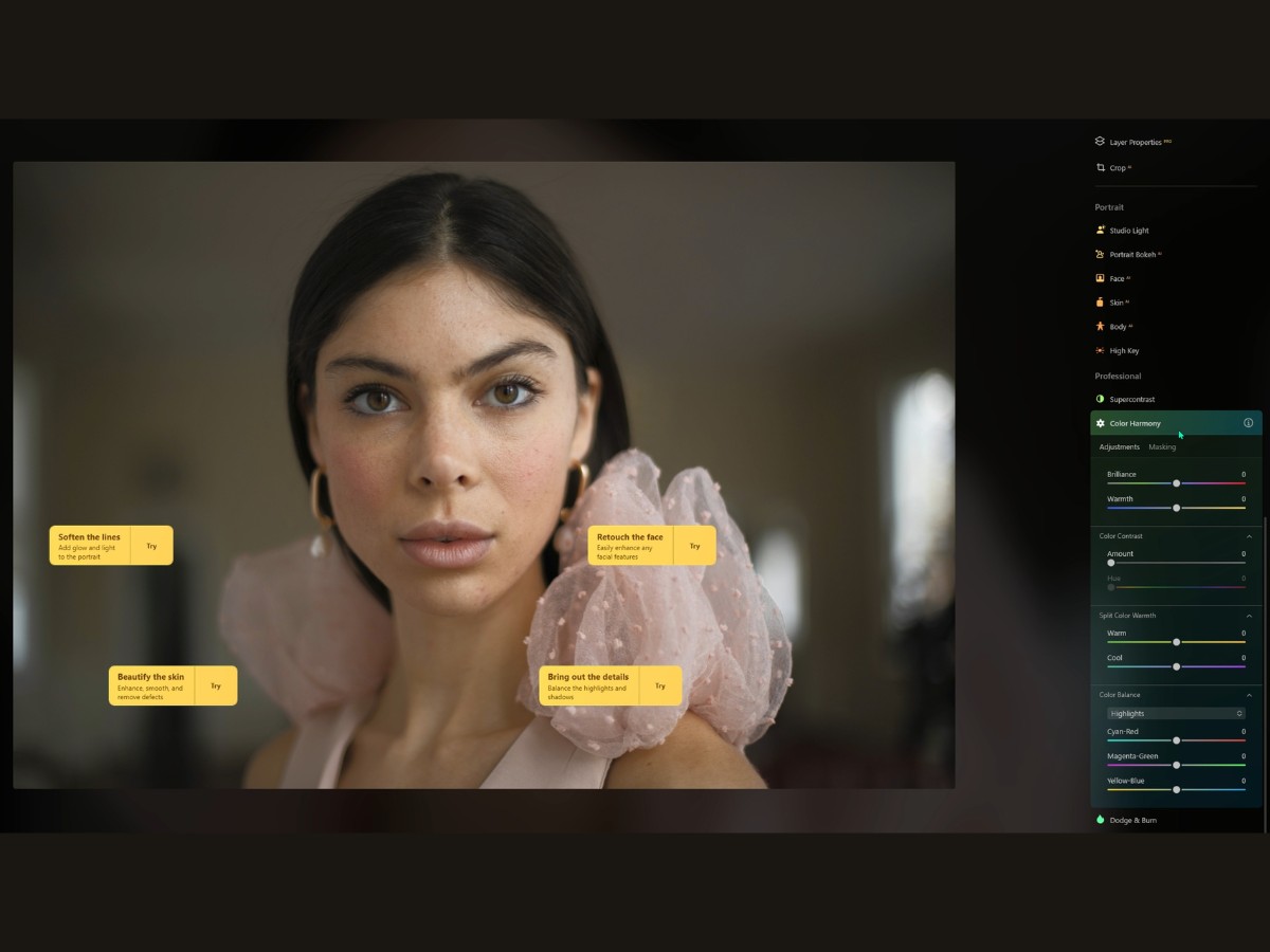
Imagine you’ve got a picture that's kind of flat, like a soup that needs a pinch of salt. You pop into the Supercontrast tool, and suddenly, you can season your photo just right. You've got these sliders for the highlights, mid-tones, and shadows.
It's like adjusting the bass, treble, and mid-on your stereo to get that perfect sound, but for your eyes. Let’s break it down.
You scoot the highlights slider up, and it’s like making the bright parts—say, the glint in someone's eyes or the shiny part on a ripe apple—pop without turning the whole picture into a bleach party.
The mid-tones slider is the one that’s like a good life coach; it brings out the details that give the picture its character and feel.
Then, there’s the shadows slider, which adds depth and mystery by making the dark parts richer.
Now, here’s where it gets even cooler: the Balance sliders. They're like the fine-tuning dials. Say you’ve cranked up the highlights, but now your friend's forehead is too bright. You mess with the Highlights Balance, and you can bring back the detail without losing the overall oomph.
35. Color Harmony
The Color Harmony tool is like your photo’s personal stylist, giving you the power to tweak and tune the colors until everything sings in perfect… well, harmony.
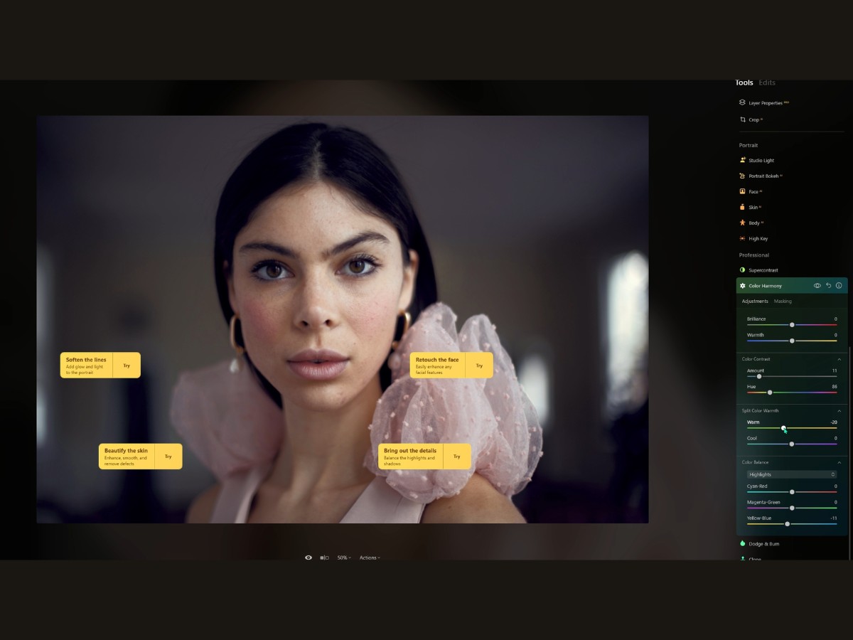
Let’s start with the Brilliance slider. It’s like turning up the vibrancy of life. Slide it up, and the colors in your photo get richer as if you’ve dialed up the intensity of the world itself. It’s great for making those good photos look great, giving them an extra punch of 'wow.'
Next up, Warmth. It’s pretty straightforward: slide one way, and your photo gets a sun-kissed glow; slide the other way, and it's like you’ve dipped it in a cool, refreshing pool. It can change the mood of your photo from a warm summer afternoon to a cool winter morning in just a tweak.
Now, let’s chat about Color Contrast. This is a really neat one. Do you know how some images look a little flat? This slider lets you pick a color and make it pop. It's like a spotlight for specific colors, making them stand out by pushing their opposites back. It's a game-changer for making specific elements in your photos stand out without having to edit everything piece by piece.
Then there’s the Split Color Warmth, which is like having two temperature dials for your photo—one for the warm tones and one for the cool ones. You can cool down those blues and greens or make the reds and yellows sing, giving you the power to control the emotional temperature of your photo.
And lastly, we’ve got the Color Balance. This one’s all about fine-tuning. It’s like mixing paint on a palette, adding a bit more blue here, a touch of red there, and getting the colors just right. You can work on the shadows, mid tones, or highlights separately, tweaking the color balance in each to craft the perfect scene.
36. Dodge & Burn
The Dodge & Burn tool is like the fine brush of a master painter, subtly adding light here and shadow there to bring out the drama in your images. It's like having the power of the sun in one hand and the coolness of the shade in the other.
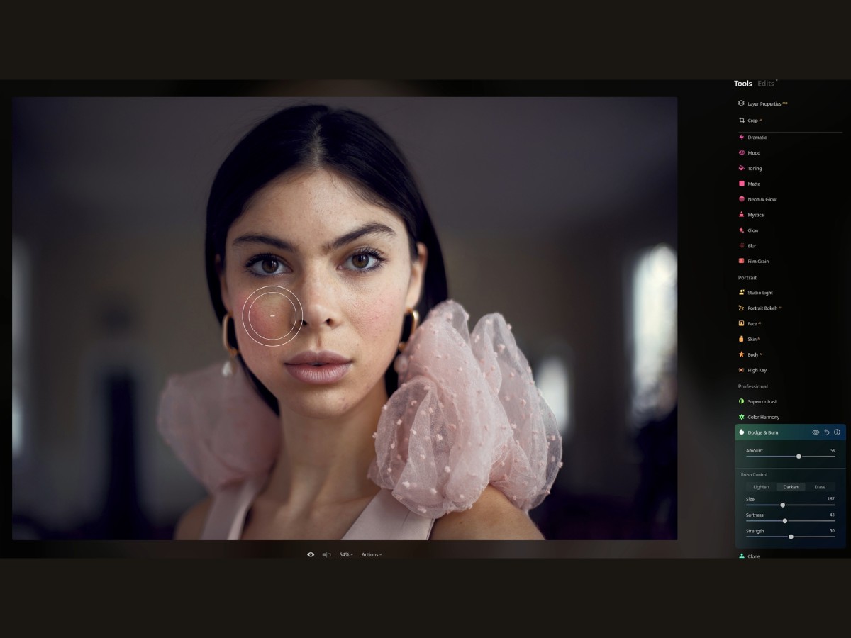
Back in the day, photographers would physically hold back light to 'dodge' and let more light hit the photo to 'burn'. It’s an art, really, and now it's all at your fingertips, no chemicals needed.
You’ve got two main superpowers here: Lighten and Darken. Choosing Lighten is like shining a gentle flashlight onto parts of your photo. It lifts the shadows, making the details play peek-a-boo with the viewer.
Darken, on the other hand, is like drawing the curtains to add some mystery, enhancing the depth and contrast. Your brush size can be a delicate little thing for pinpoint accuracy or broad for sweeping changes. It’s like choosing between a scalpel and a brush – one for the details, the other for the big picture.
Those bracket keys on your keyboard are like the zoom on a camera lens, '[]', making your brush size jump up and down at your command.
Then there's softness. Imagine you're blending a smoothie; you want that gradient to be just right. No harsh lines, just a perfect fade from light to dark. It's all about making changes that feel natural like they've always been a part of the picture.
Strength? That's your volume control. Crank it up for bold changes, or keep it low for that whisper of a difference. Paint over your canvas - your photo, I mean - and watch as it transforms, almost like you’re sculpting with light. Whoops, made a mistake? No worries.
The Erase tool is your little eraser, scrubbing out any oopsies. And if you really want to just wipe the slate clean and start again, there's a reset button that takes you back to square one.
Finally, there's the Overall Amount slider. Think of it as your grand finale. It's where you step back, squint your eyes, and decide just how much of this light and shadow dance you want to keep. It's the final layer of finesse, the seasoning to taste.
37. Clone
Say you've snapped a perfect shot, but oh no, there's a pesky soda can in the middle of your pristine beach photo.
Enter the Clone tool, your personal digital genie.
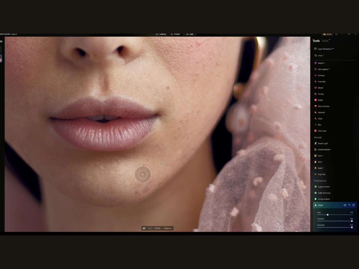
Imagine this: you open up your image in Luminar Neo, and there it is, that unwelcome intruder. With a flick to your trusty Clone tool, you’re ready to work some magic. It's like picking up a magic brush that paints with pieces of the picture.
So, you set your source point—think of it as choosing the perfect paint on your palette. This is the clean, pristine part of your image you'll use to cover up the unwanted bits. It’s like telling the tool, “Hey, see these nice, clean pixels? Let’s use these to fix the mess.”
You’ll get your brush just right with a slide here and a tweak there. Radius, Softness, Opacity—it's like tuning your instrument before you play the first note.
The Radius decides how big your brush is; you don’t want to be swatting a fly with a sledgehammer, right? Softness is all about how gently you want to blend the cloned pixels into your masterpiece. And Opacity, well, that’s like choosing whether to whisper or shout.
Then you dive in, painting over the blemishes like an artist restoring a vintage painting. Zoom in, get comfy, and start clicking away, painting over those pixels. Each stroke is a stroke of genius, each dab a delicate touch-up. You’re not just cloning pixels; you’re weaving new stories into your image.
Got too enthusiastic with your strokes? No sweat. Hit undo, and like a gentle tide washing over footprints in the sand, your last move is just a memory. You can undo each step, one by one, until you're back where you want to be.
And here’s a pro tip for you: Don't just hammer away with a 100% opaque brush. That's like splashing paint on a canvas. Instead, be a little sneaky about it. Use a lower opacity, build it up slowly, and watch the magic happen. And keep dancing around the image, picking different parts to clone. Variety’s the spice of life, after all.
3. Edits section
Lastly, let's take a look at the Edits section. The Edits section is essentially your photo editing diary in Luminar Neo.
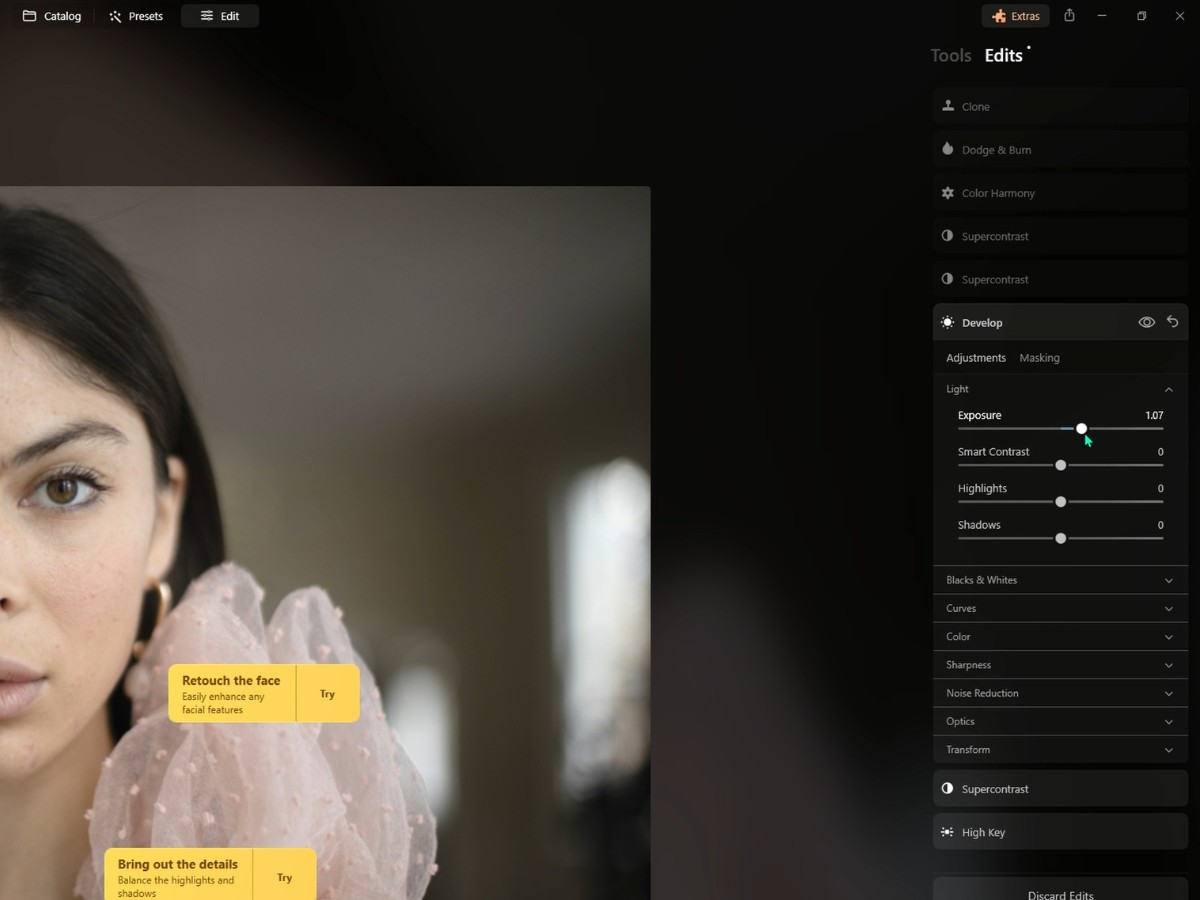
Let's say you've been working your creative mojo, jumping from tool to tool, adding a pinch of contrast here, a smidge of saturation there, and now you've got a layered cake of edits.
The Edits section is where you can see each layer of that cake, all neat and stacked. It's like the "previously on" section at the start of your favorite series, showing you all the twists and turns you've taken with your image. Every little (or big) change you've made, it's all listed there. It’s pretty awesome because you get this comprehensive list of the tweaks you've applied, and each one is like a checkpoint. You can revisit any of these points without affecting the others—like having a time machine for each step in your process.